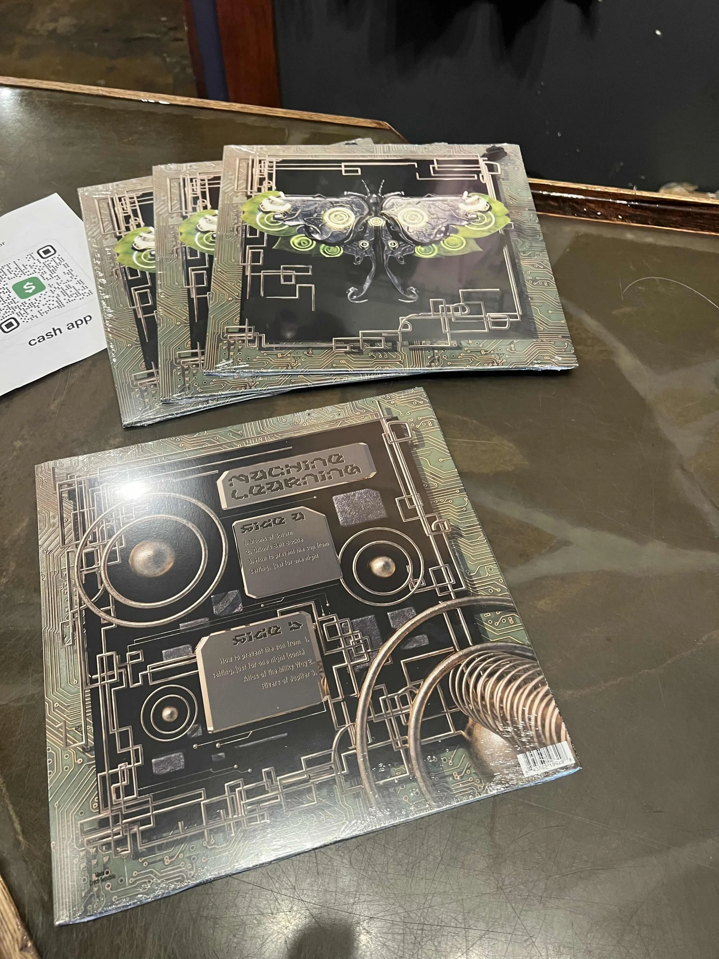
「MACHINE LEARNING」
Client
Atlanta Space Quartet
Year
2024
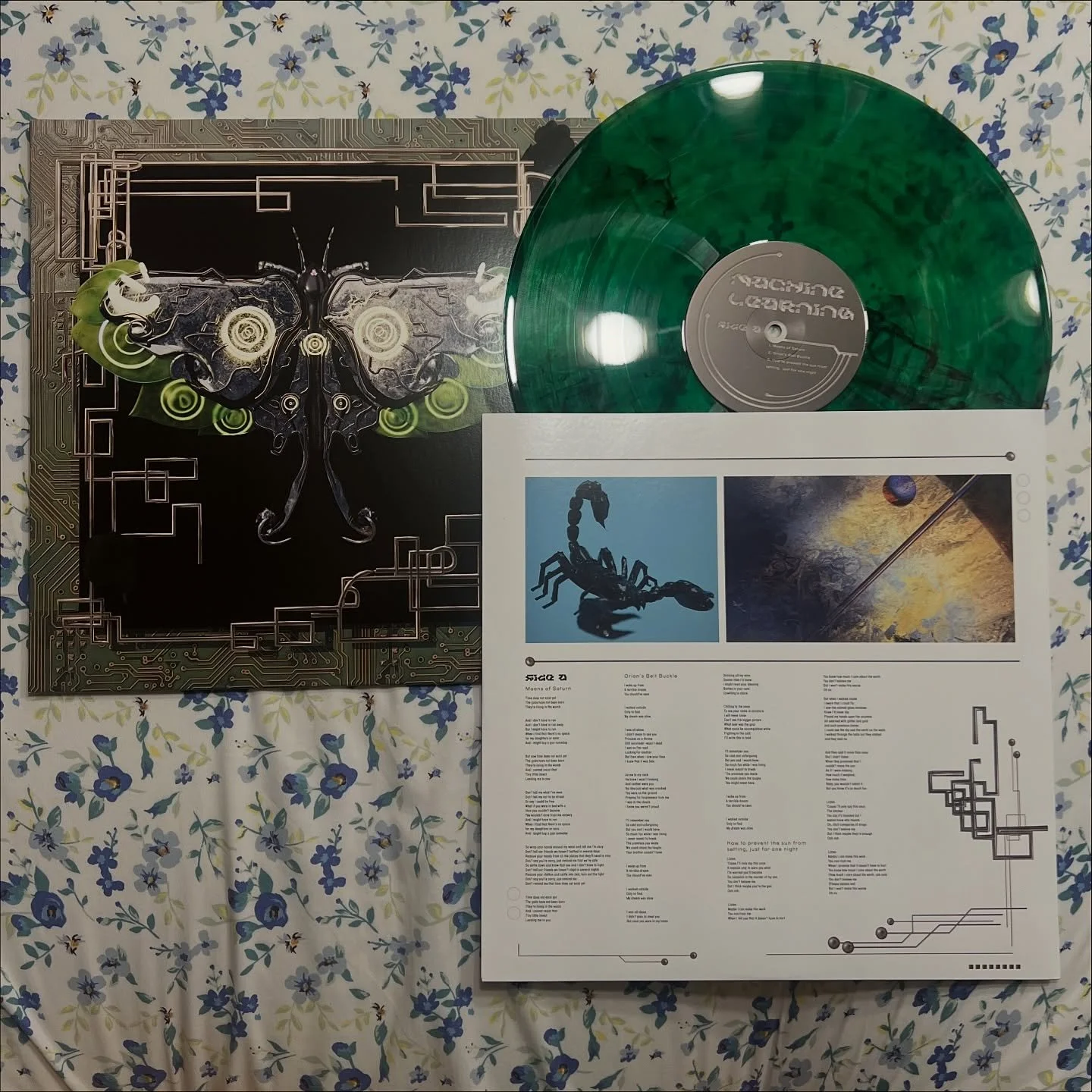
After collaborating with Atlanta Space Quartet to create the cover art for their single "Orion's Belt Buckle", I was tasked with designing the album cover and packaging for the full vinyl release of their album “Machine Learning”. I worked closely with members of the band to ensure the appropriate aesthetic vision was realized while providing numerous iterations and options to ensure flexibility. I coordinated with A to Z media to match the deliverables to the physical design requirements of the packaging, and worked with the band to choose the specific disc coloration and finish from A to Z's catalogue.
Atlanta Space Quartet has been experimenting with creative ways for performers to interact with tech. In a live band, this might look like a kick drum triggering a synth base while another band member is in control of which pitches are actually available to be triggered, or using a sidechain compression to duck live violin when drums play. This creative interaction with tech was the inspiration for the name of the album. For the basis of the album’s imagery, we took inspiration from computer history, when the first literal “bug” was found in between the Relay Contacts of the Harvard Mark II.
「A BUG IN THE MACHINE」
「THE INSPO」
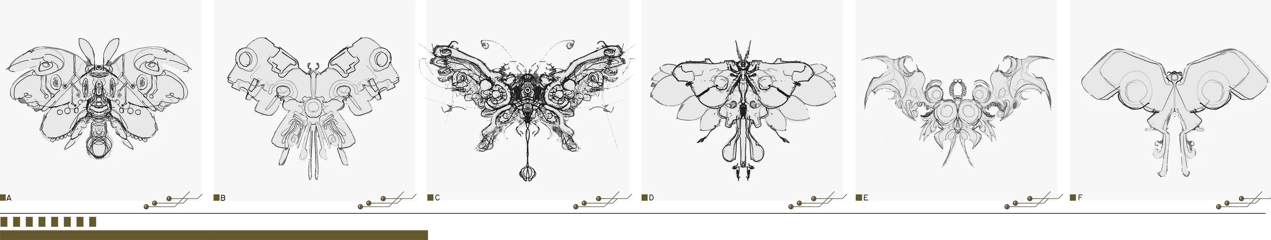
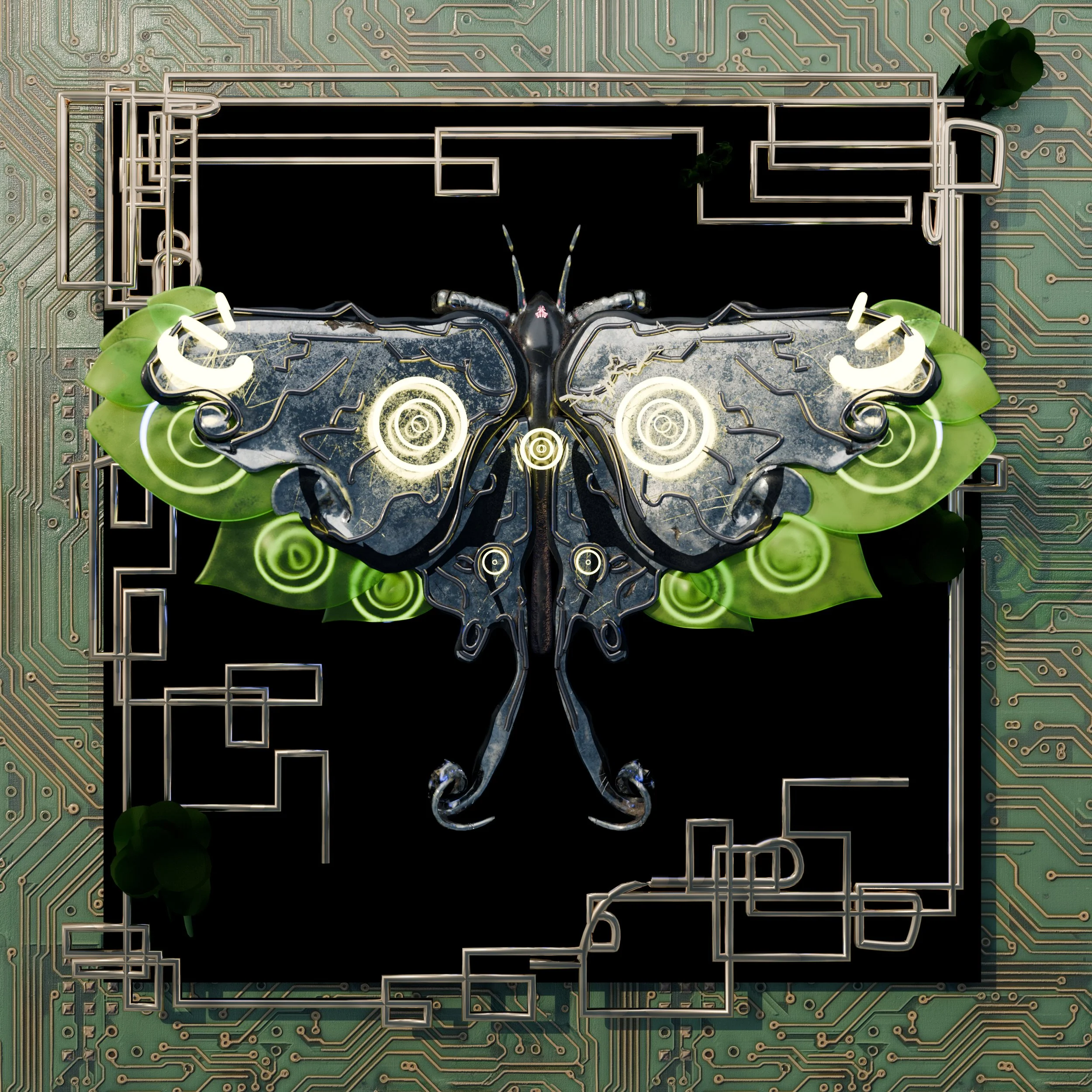
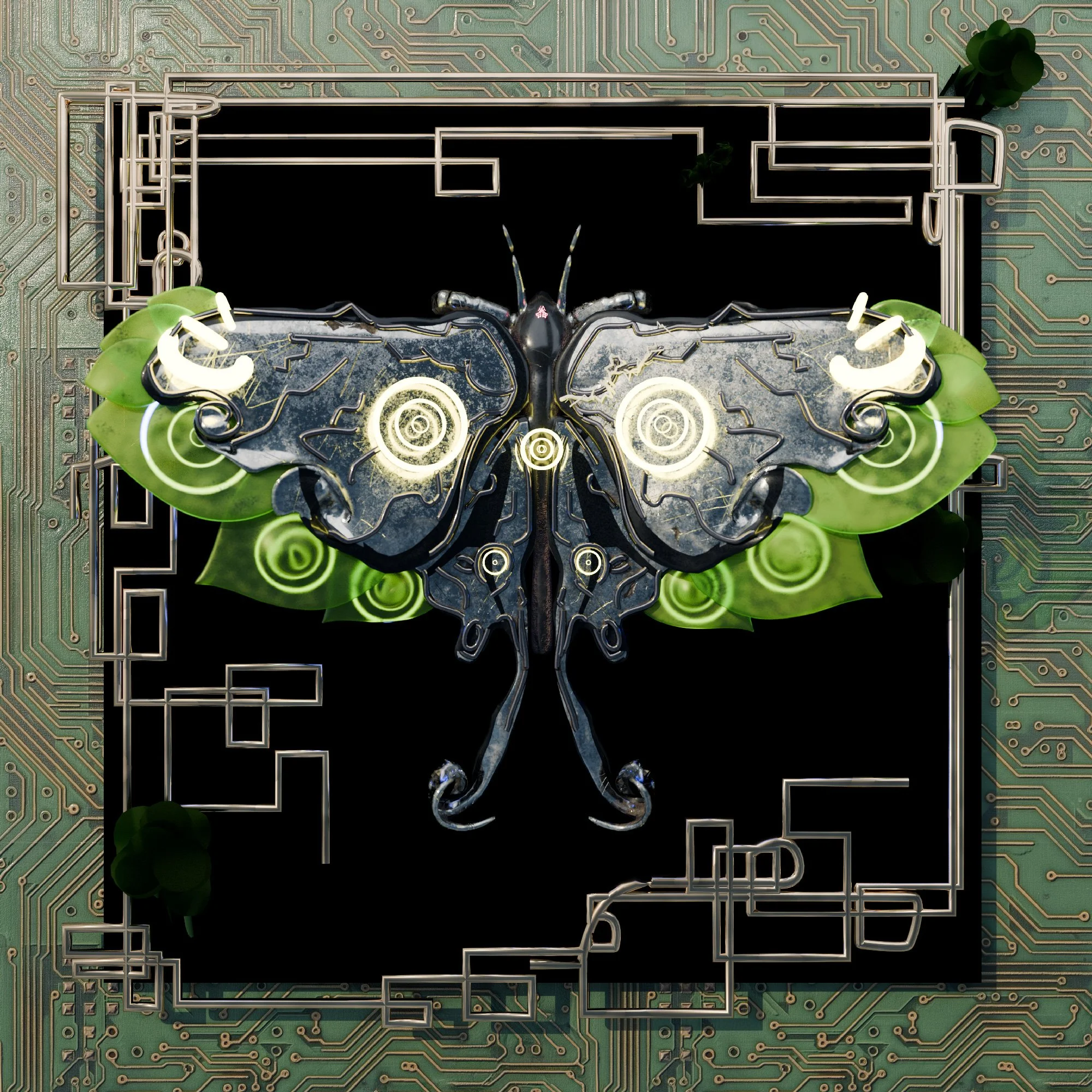
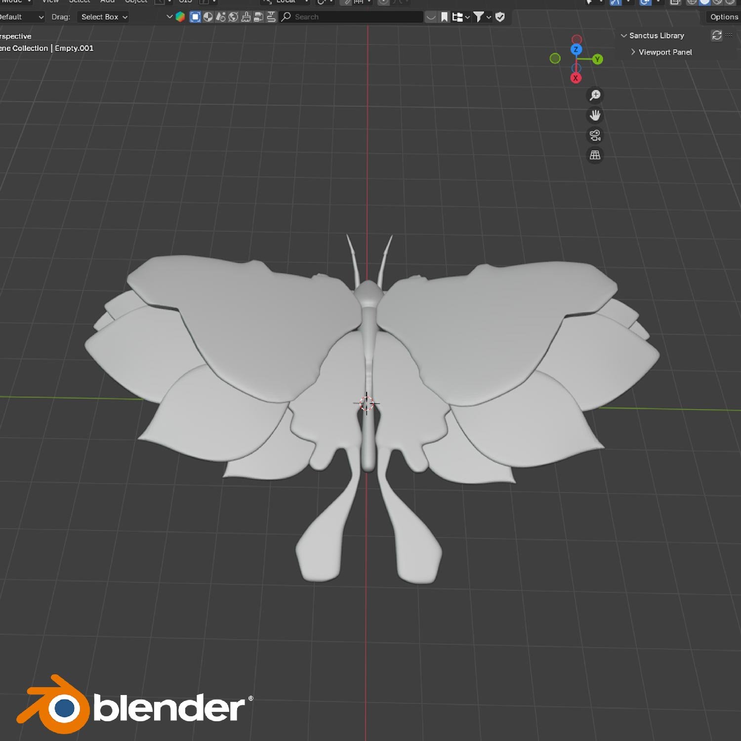
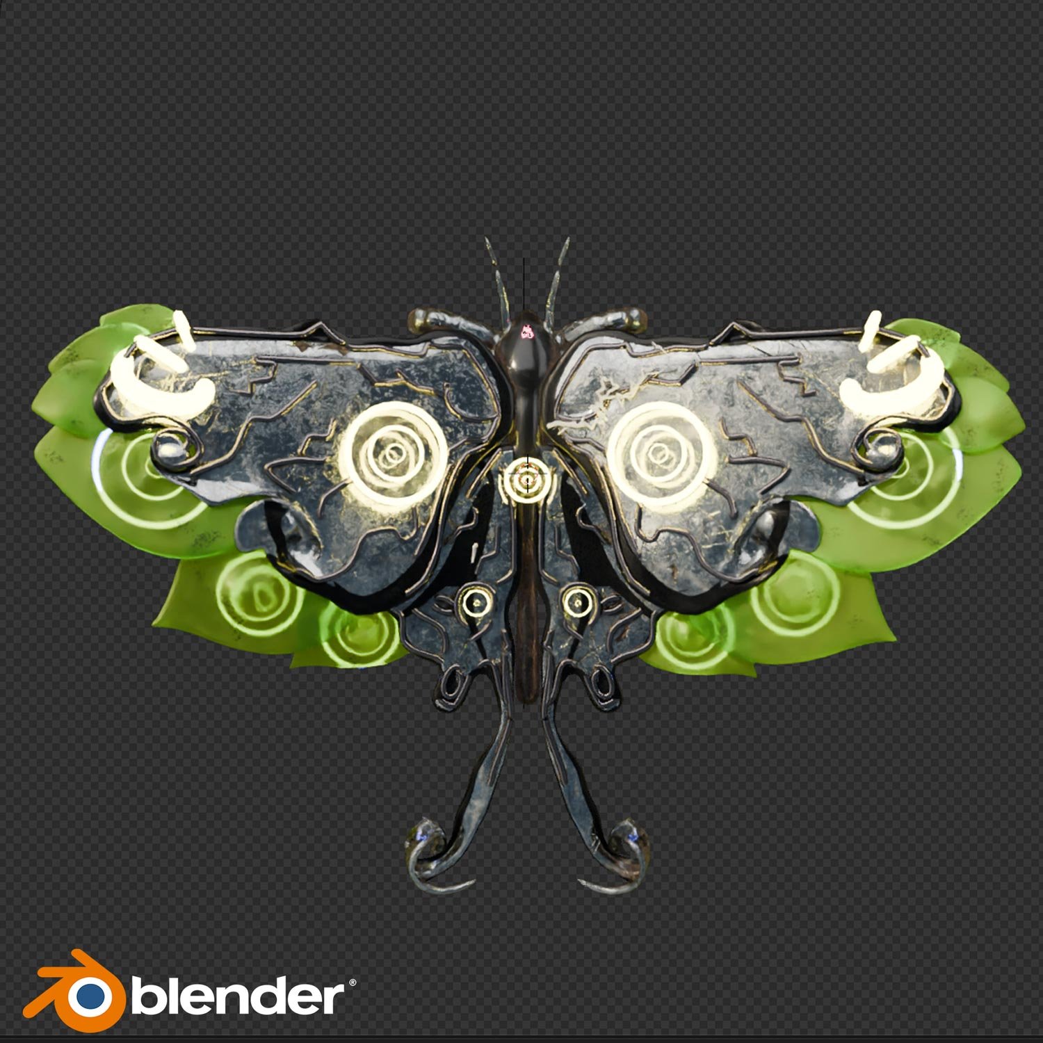
I started concepting for the album cover by sketching out a variety of moths inspired primarily by the North American Moon Moth, as per band request. I sought to incorporate and explore various elements in the provided reference of steampunk items, overgrowth, ornamentation, and electronic components. The shape language we ended up proceeding with had the perfect balance of organic and technological.
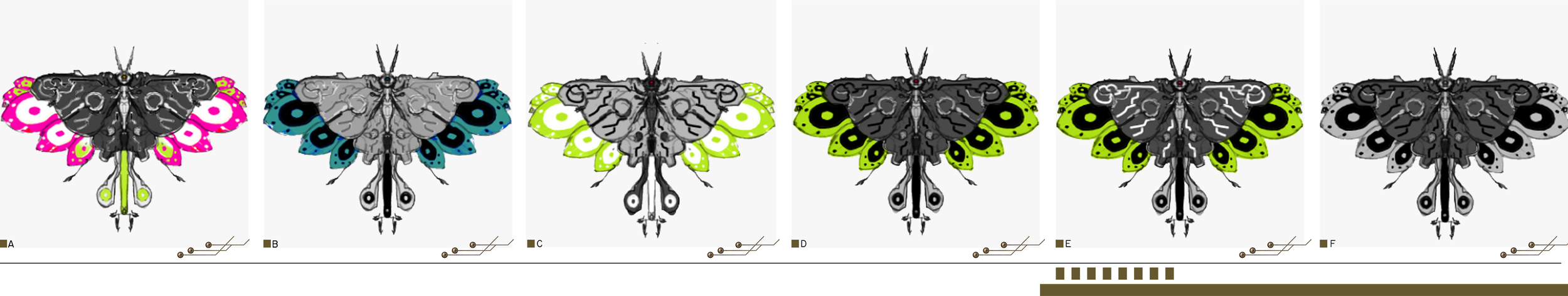
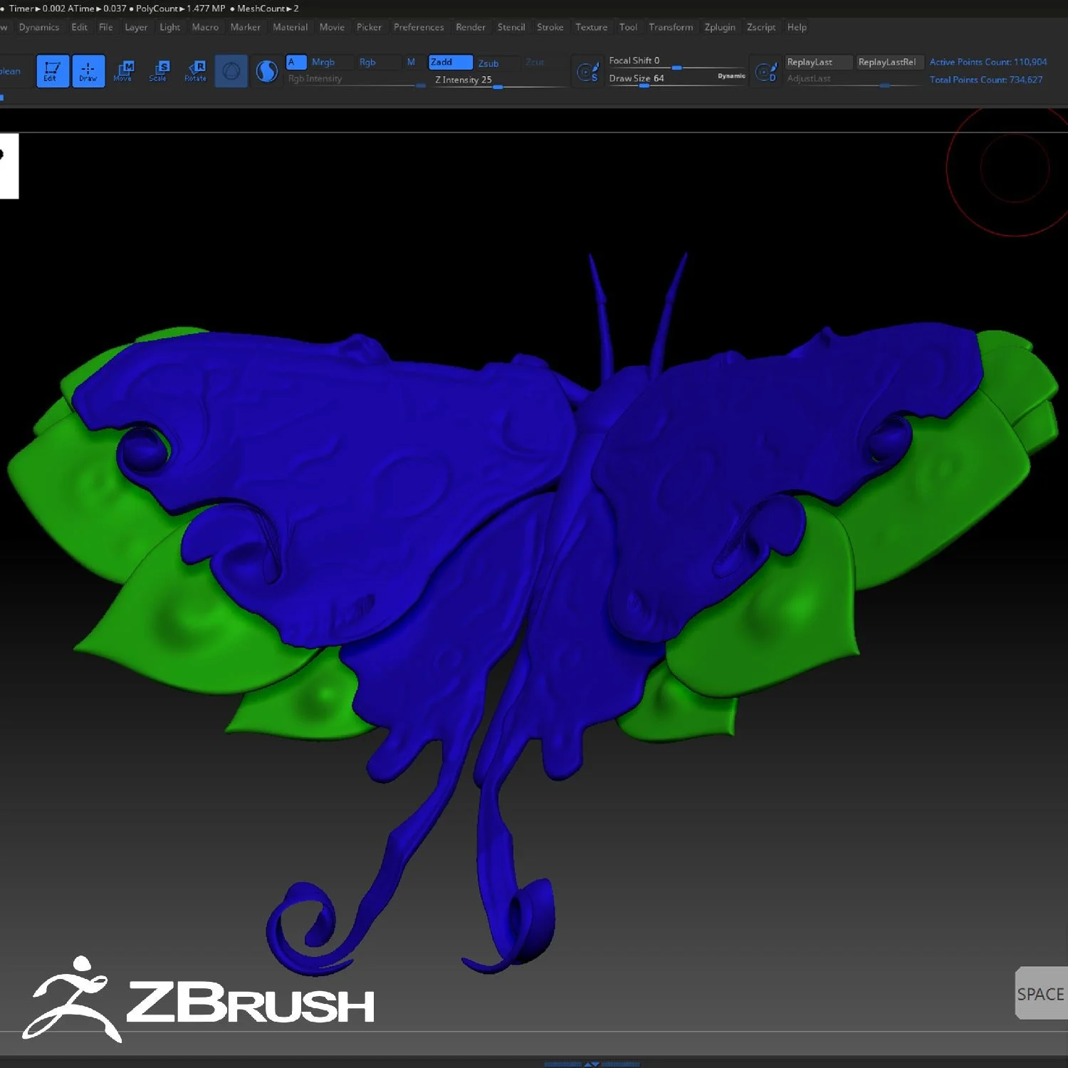
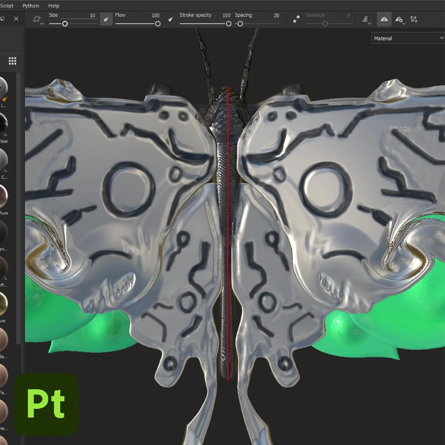
After deciding on this direction, I then went about mocking up several color variations. We ended up settling on a combination of silver and green, to incorporate some of the organic imagery of the reference into the design, while using darker colored metal for the circuit like elements seen on the back of the wings of the moth.
I then created a rough model sheet, imported it into Blender to block out the base shapes, and brought this into Zbrush to be sculpted on top of, adding spontaneous flourishes where possible to elevate the initial design . I exported this from Zbrush and then used a combination of Substance Painter and textures from BlenderKit for for the final look and feel.
「THE GARNISH」
After finalizing the direction for the moth, I set to work figuring out the background and framing elements that would be used. I explored many different shapes and garnishes, focusing primarily on gold to be in line with circuit boards, and scoured BlenderKit for textures. Since a design language that blended elements of the organic and technological was already established with the moth, I also explored several ways to incorporate greenery into the piece.
「BIOLOGICAL CIRCUITRY」

I wanted to establish a flexible catalogue of assets I could use that incorporated circuitry while also feeling semi-organic yet abstract enough that they wouldn’t feel out of place in a contemporary gallery. I explored several basic designs in Procreate before moving into Blender.
Using several simple geometry nodes setups I created many different variations on the same set of concepts, with the intention of being able to use them in both the album cover itself but also in print and web settings


After finalizing the cover with the newly created assets, I then concepted different layouts for the back cover, incorporating variations of the existing assets while also experimenting with explicit technological elements, like screens, circuit boards, processors, and more.
「THE GUTS」
「A PRESENT FROM A SMALL, DISTANT WORLD」
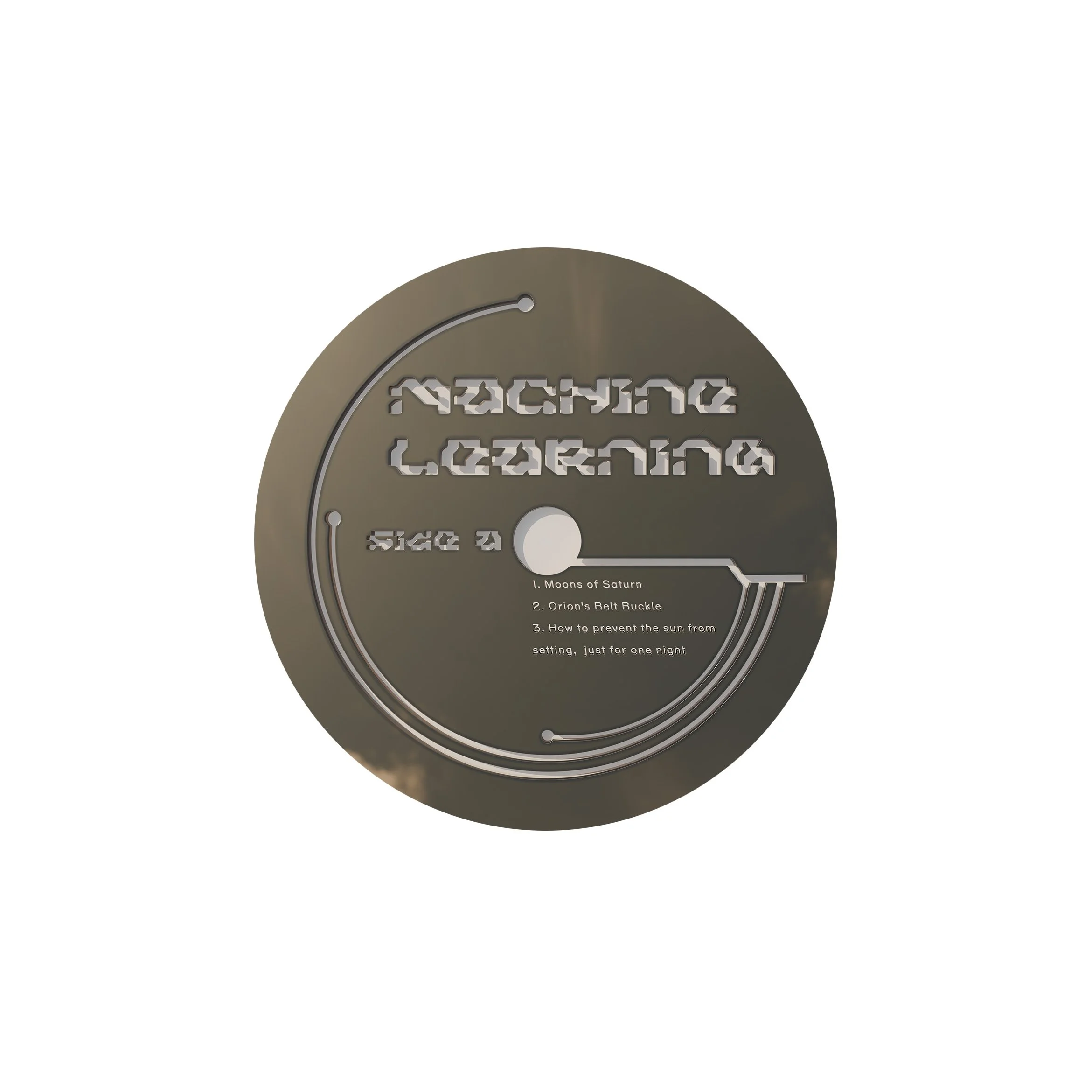
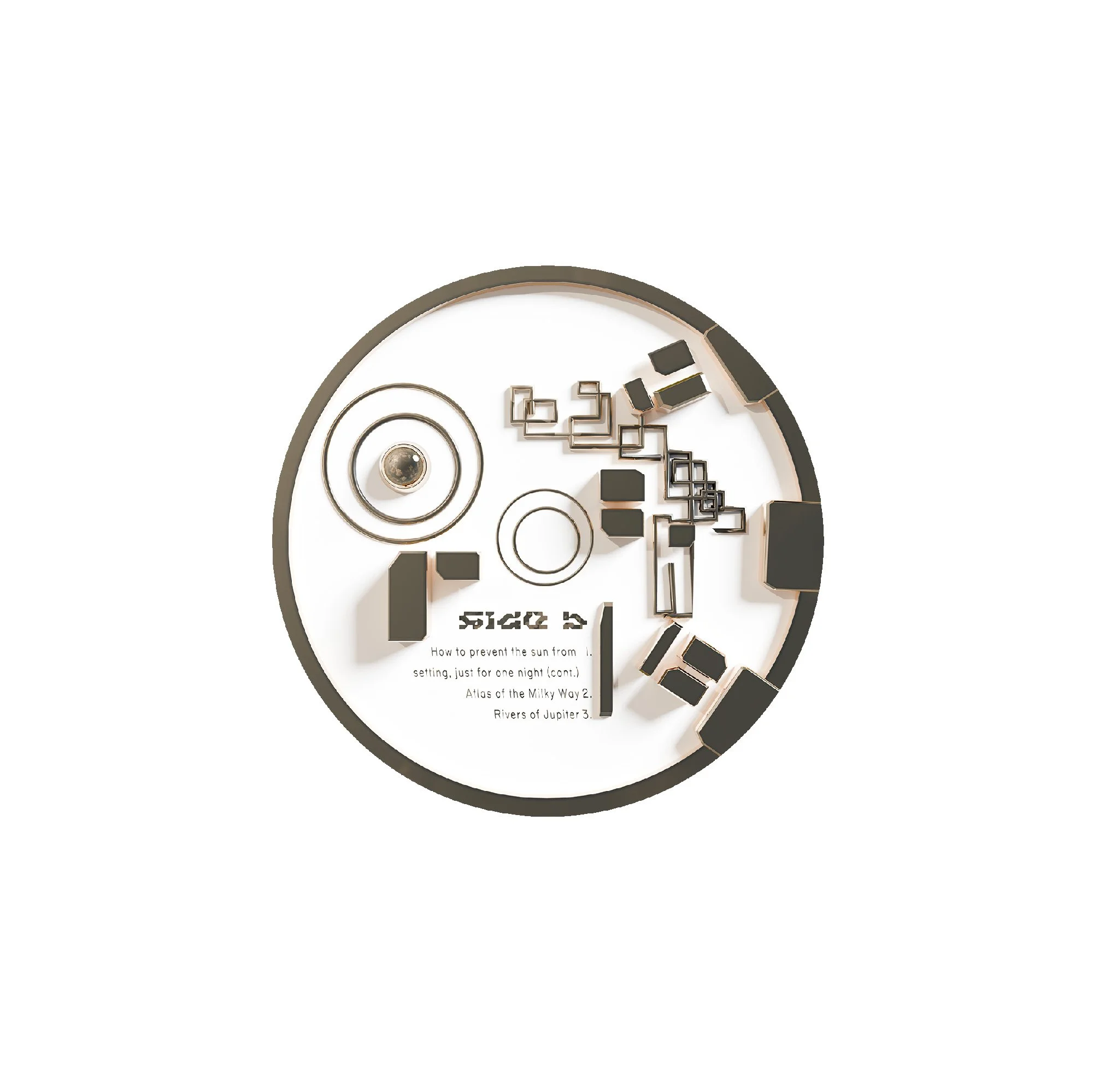
When setting out to design the back of the jacket, the inner sleeve, and the labels themselves, I explored many different design directions before settling on the final. In keeping with the gold ornamentation established on the front of the jacket, we settled on a design language consisting of concentric rings, plates, and circuitry inspired ornamentation.

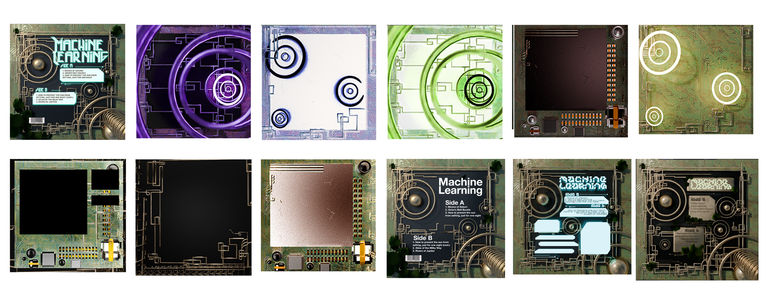
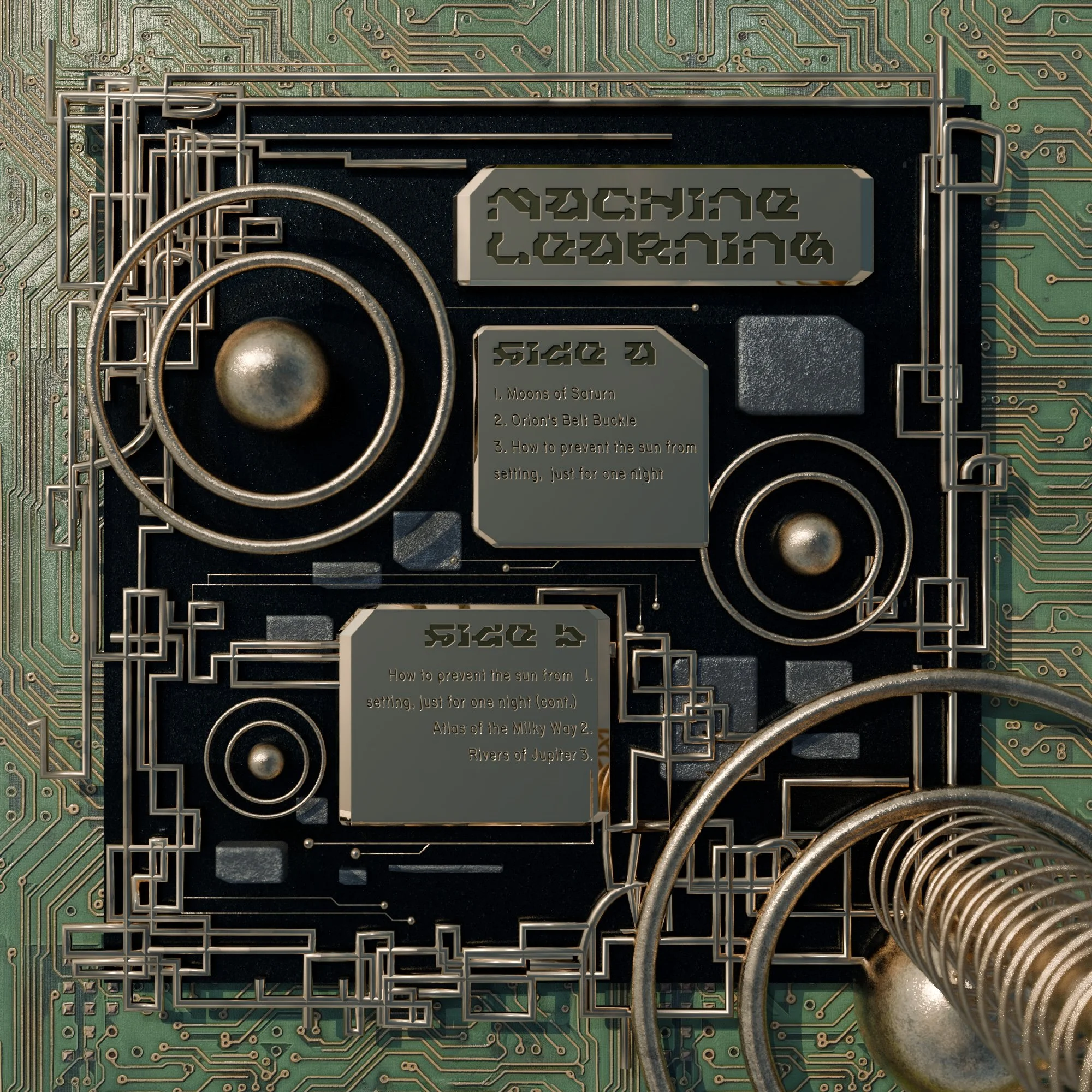
For the typography and overall treatment of the informational presentation, we took heavy inspiration from the 1977 Golden Records launched along with the Voyager Spacecraft. The timeless nature of the linear imagery and text engraved in gold felt like a good fit for the aesthetics of the album and the focus on cosmic imagery in lyrics and in name.
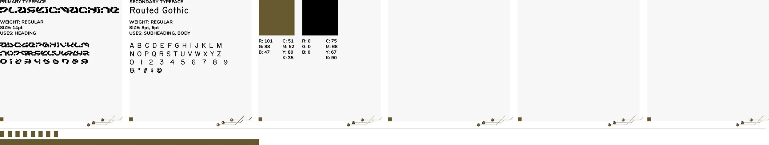
After much experimentation, the font PlasticMachine was chosen for the display type, and Routed Gothic, used in technical drawing settings and very similar to the one used on the actual Voyager Golden Record was chosen as the body typeface.