


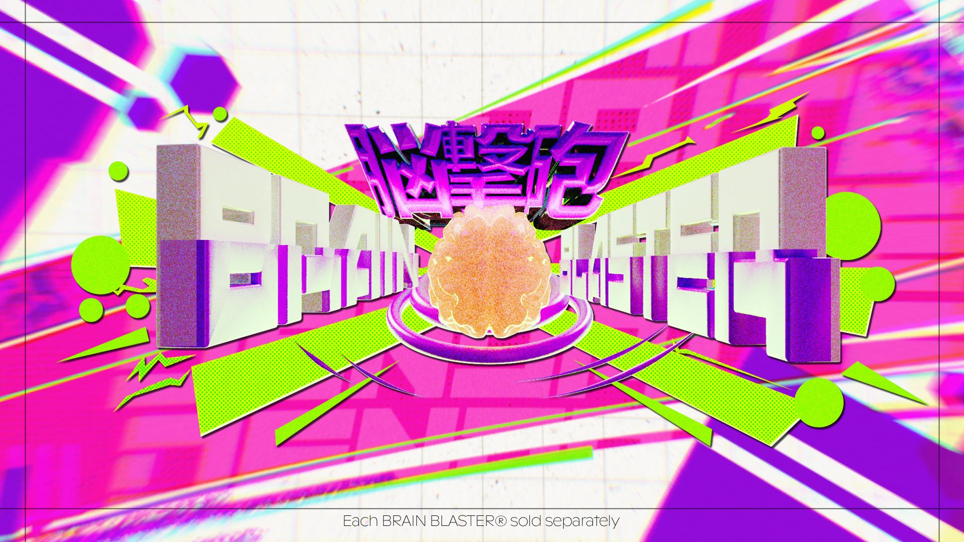
「BRAIN
BLASTERS」
Proof of Concept
Year
2025
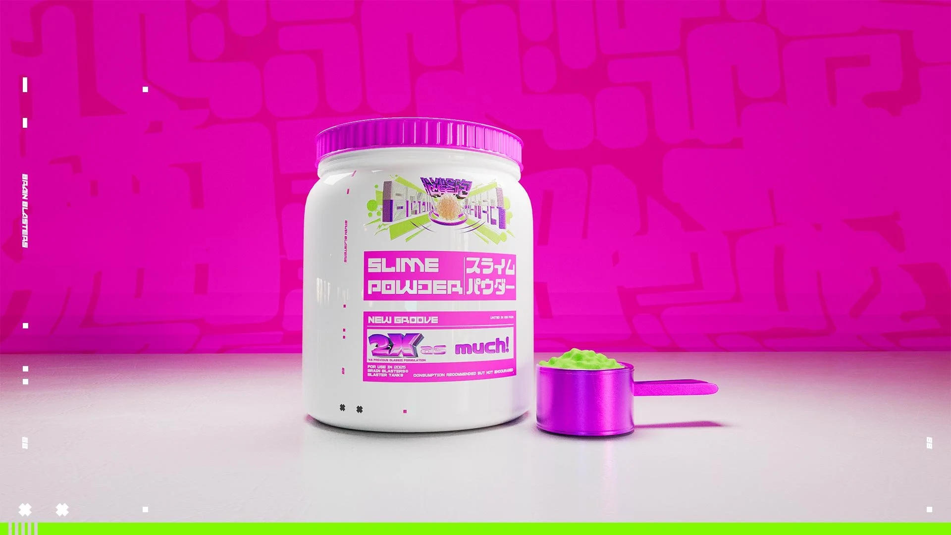
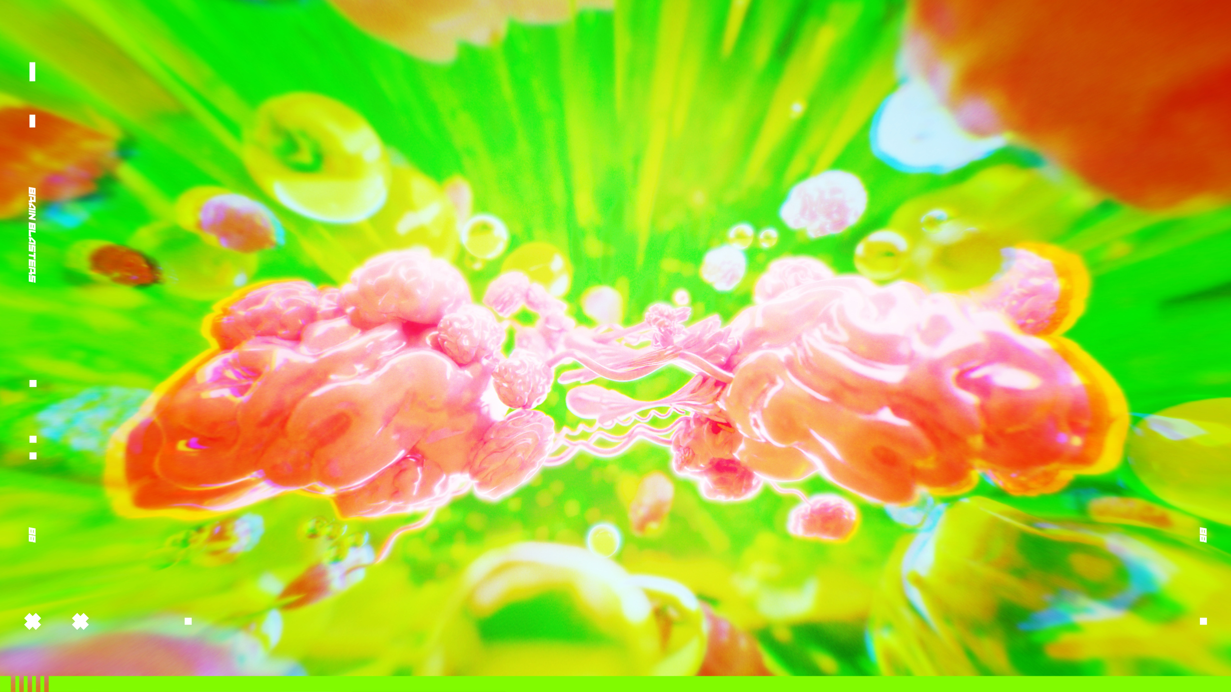
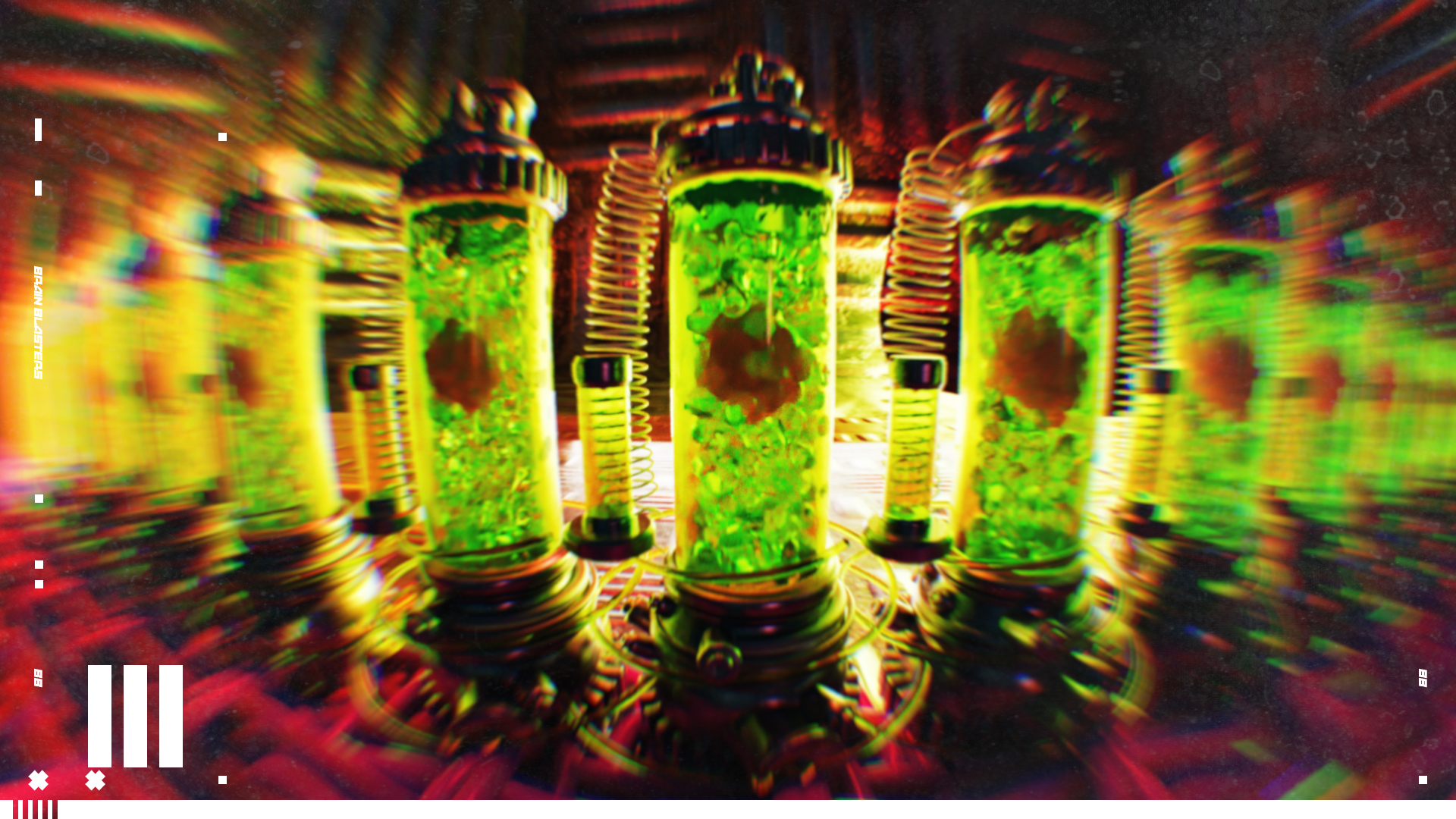
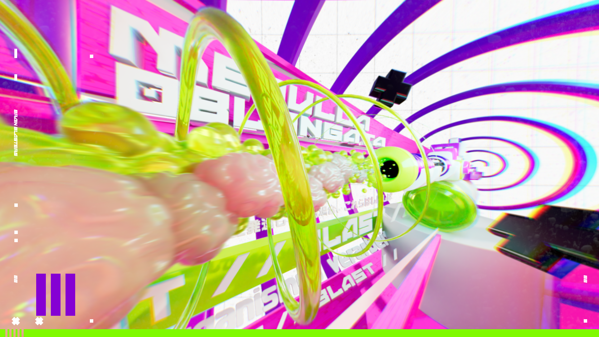
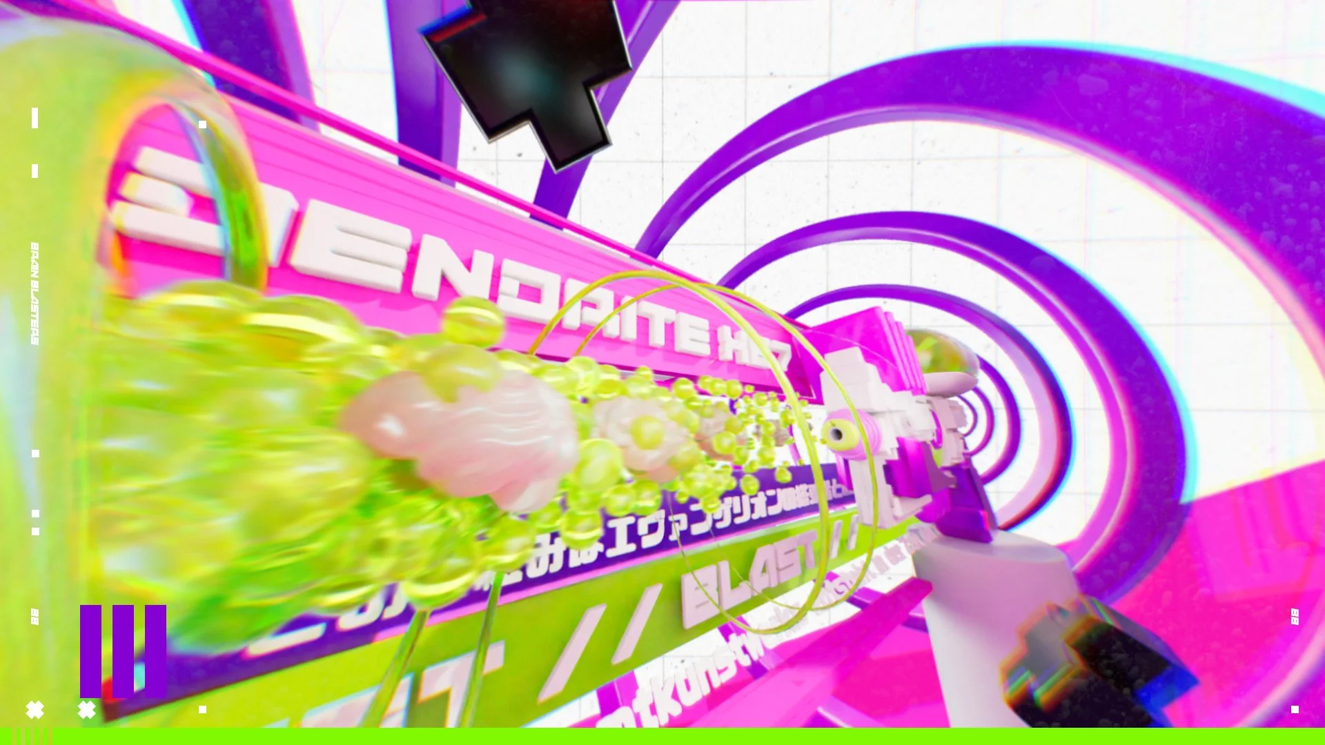
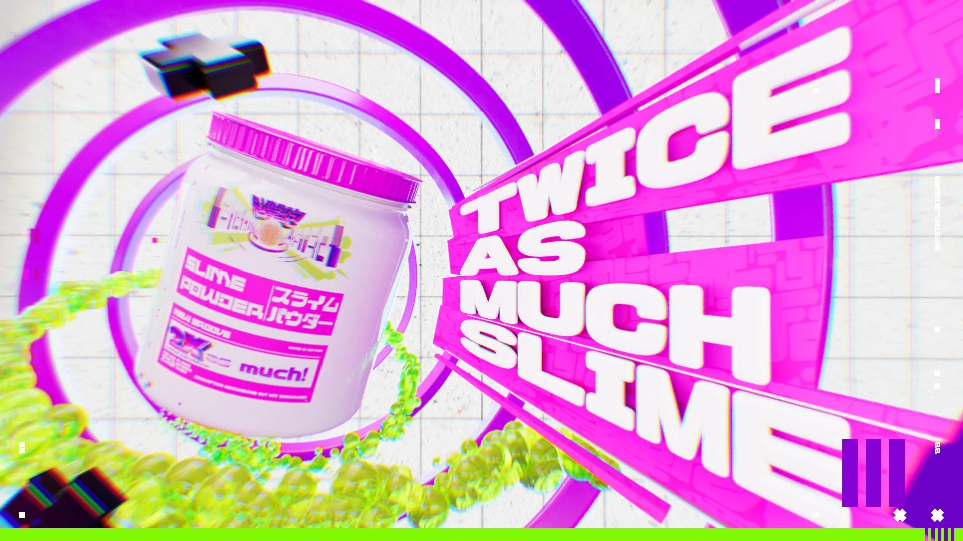
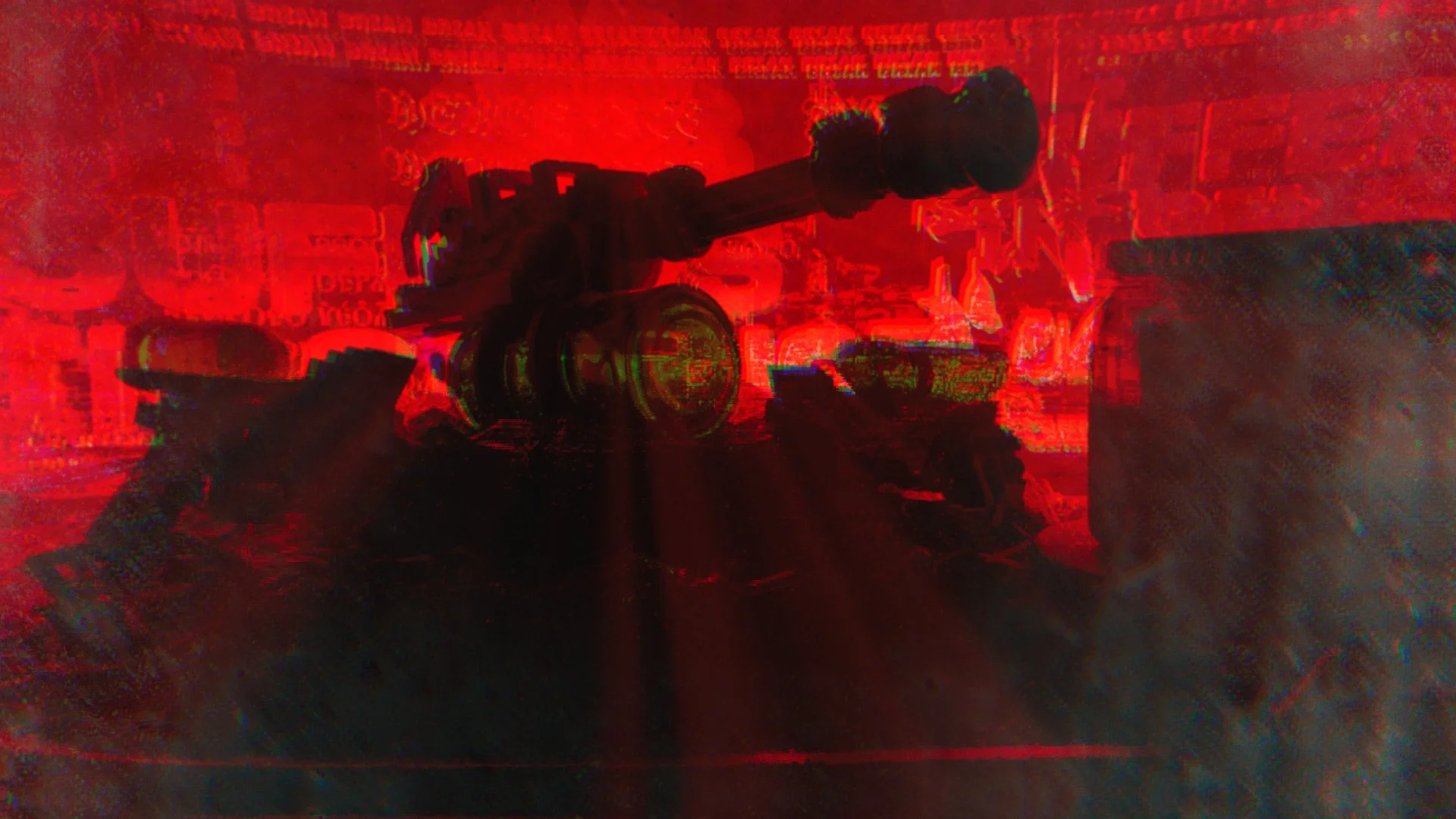
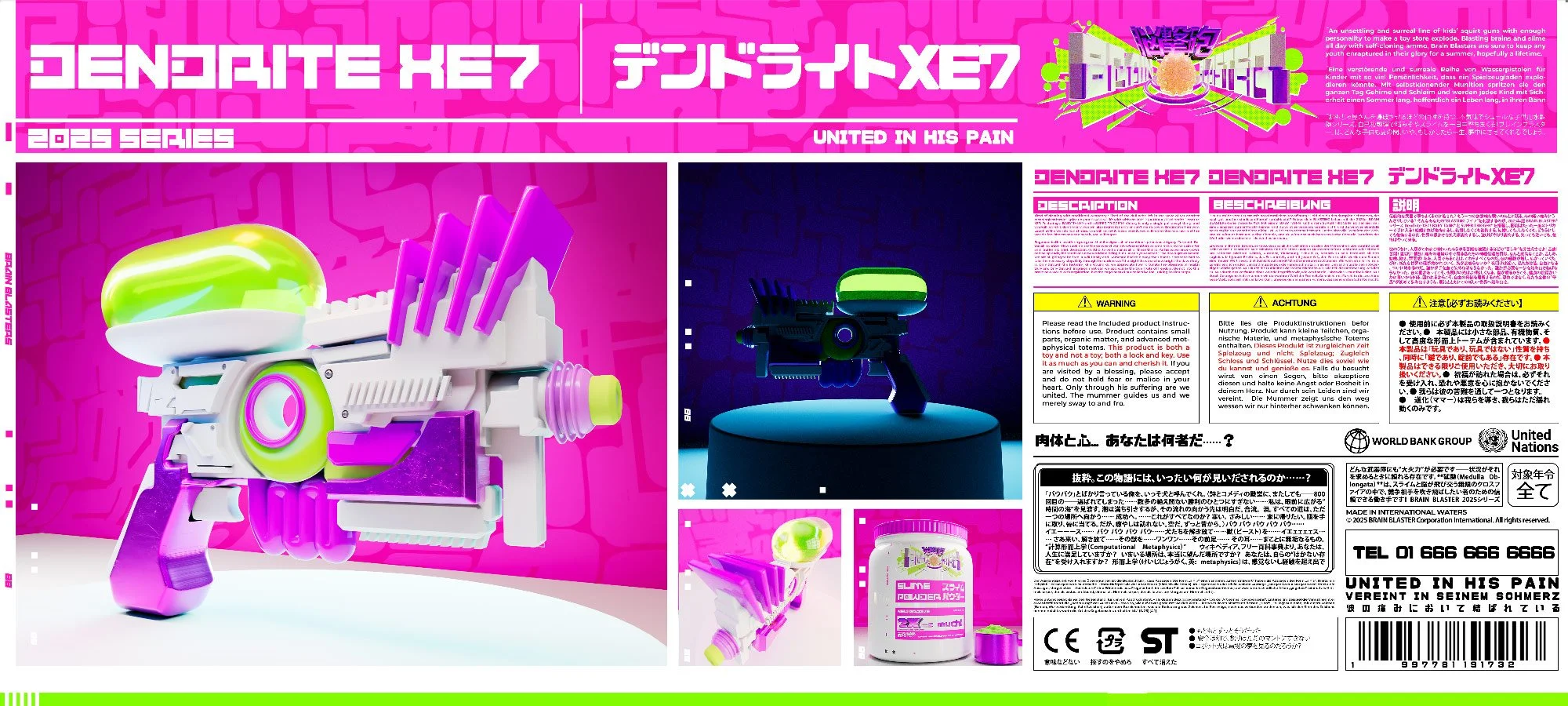
An unsettling and surreal line of kids’ squirt guns with enough personality to make a toy store explode. Blasting brains and slime all day with self-cloning ammo, Brain Blasters are sure to keep any youth enraptured in their glory for a summer, hopefully a lifetime. Neon pink and green make for a nice veneer but something darker lurks below the surface. Where do the brains come from? How does the cloning technology work? Who runs the Brain Blaster Corporation?
And most importantly, who or what is…. THE CHILD?
「STYLEFRAMES」


「ESTABLISHING VISUAL IDENTITY」
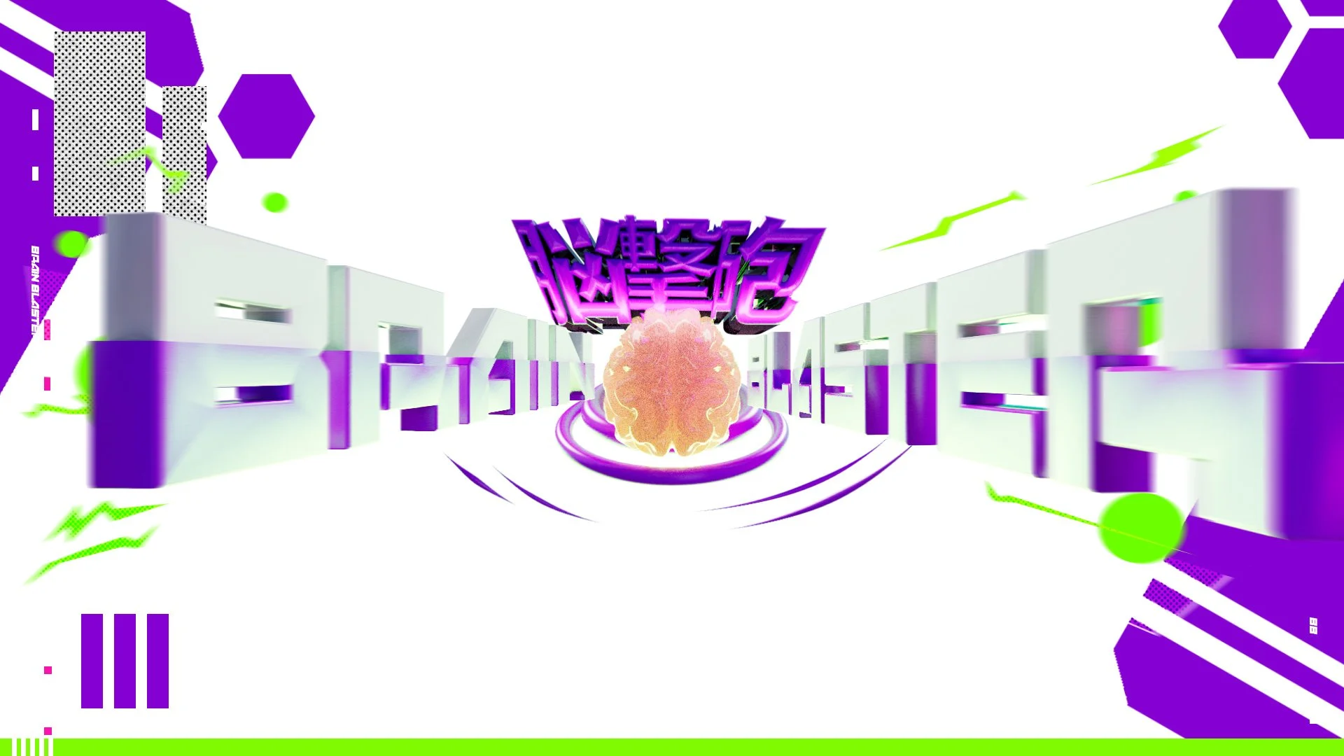
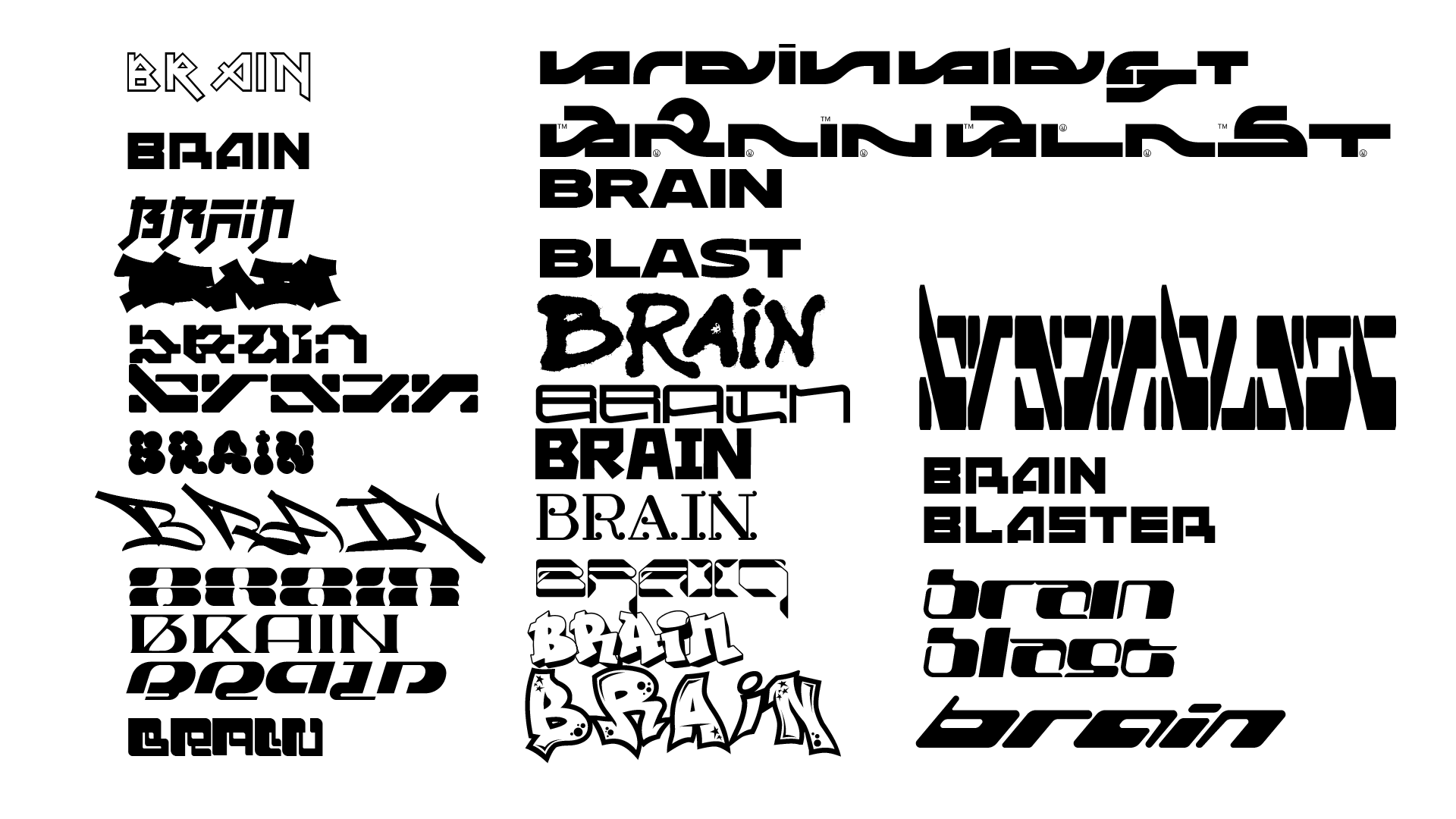
「LOGO」
I started by exploring typefaces for the logo. Taking inspiration from street art and various Japanese media properties, I aimed to find a font that had a good balance of legibility, chunkiness, and counter-cultural flare. Feeling confident with a direction that emphasized the angularity of blasts and explosions, I mocked up several logo options in 2D prior to moving into Cinema 4D for the final lockup.

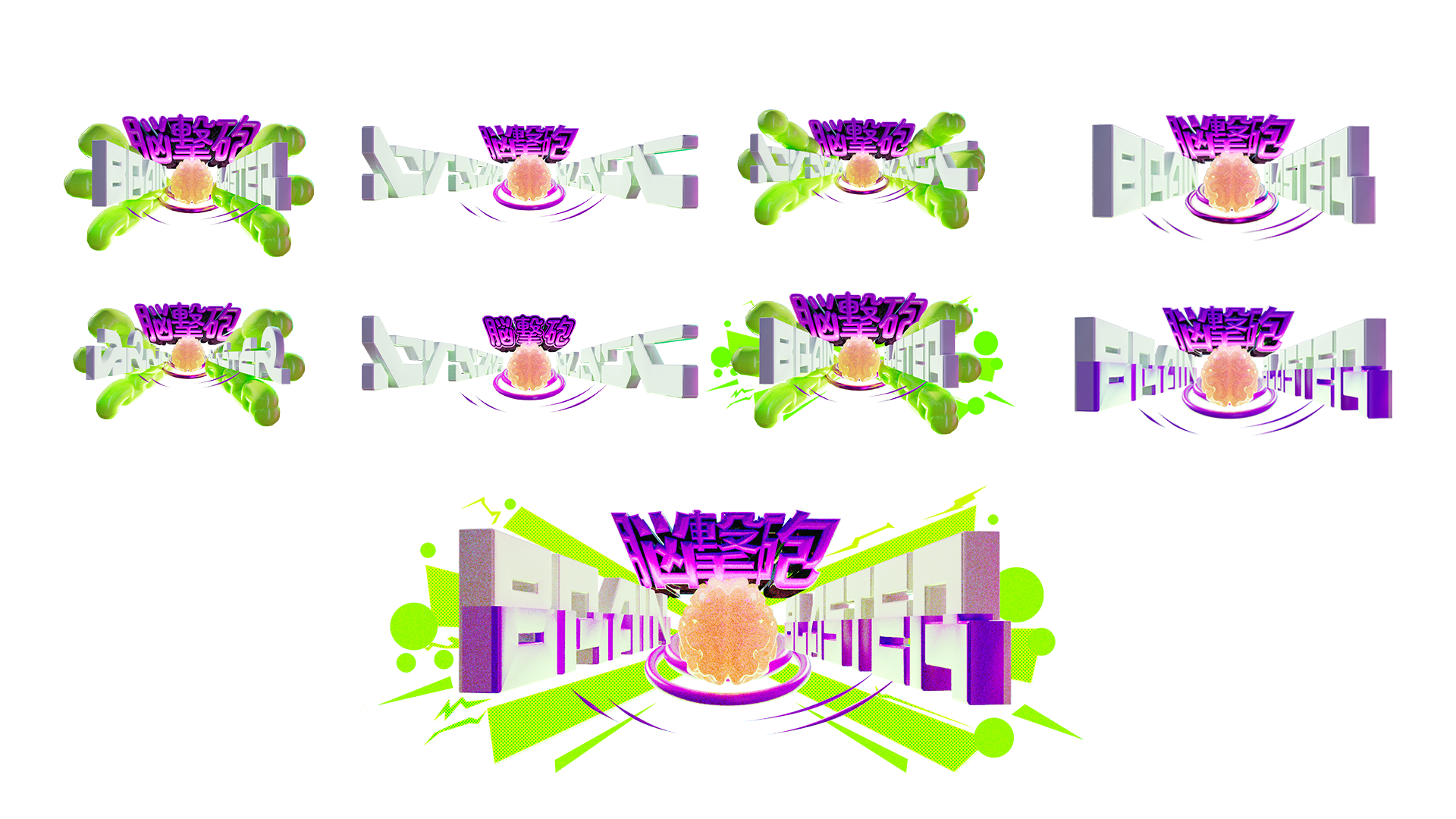

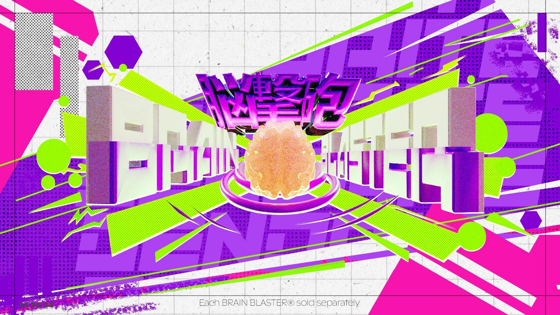
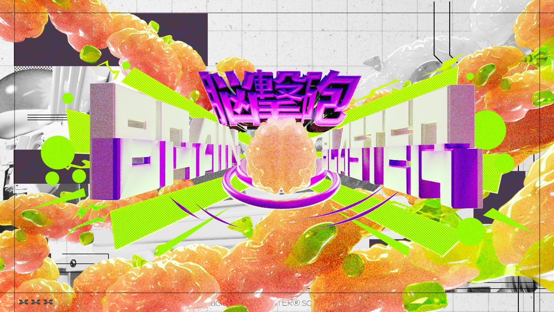
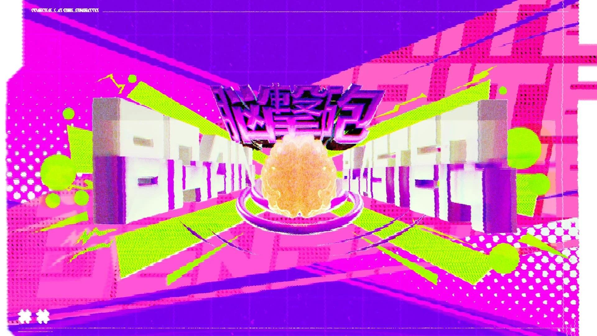
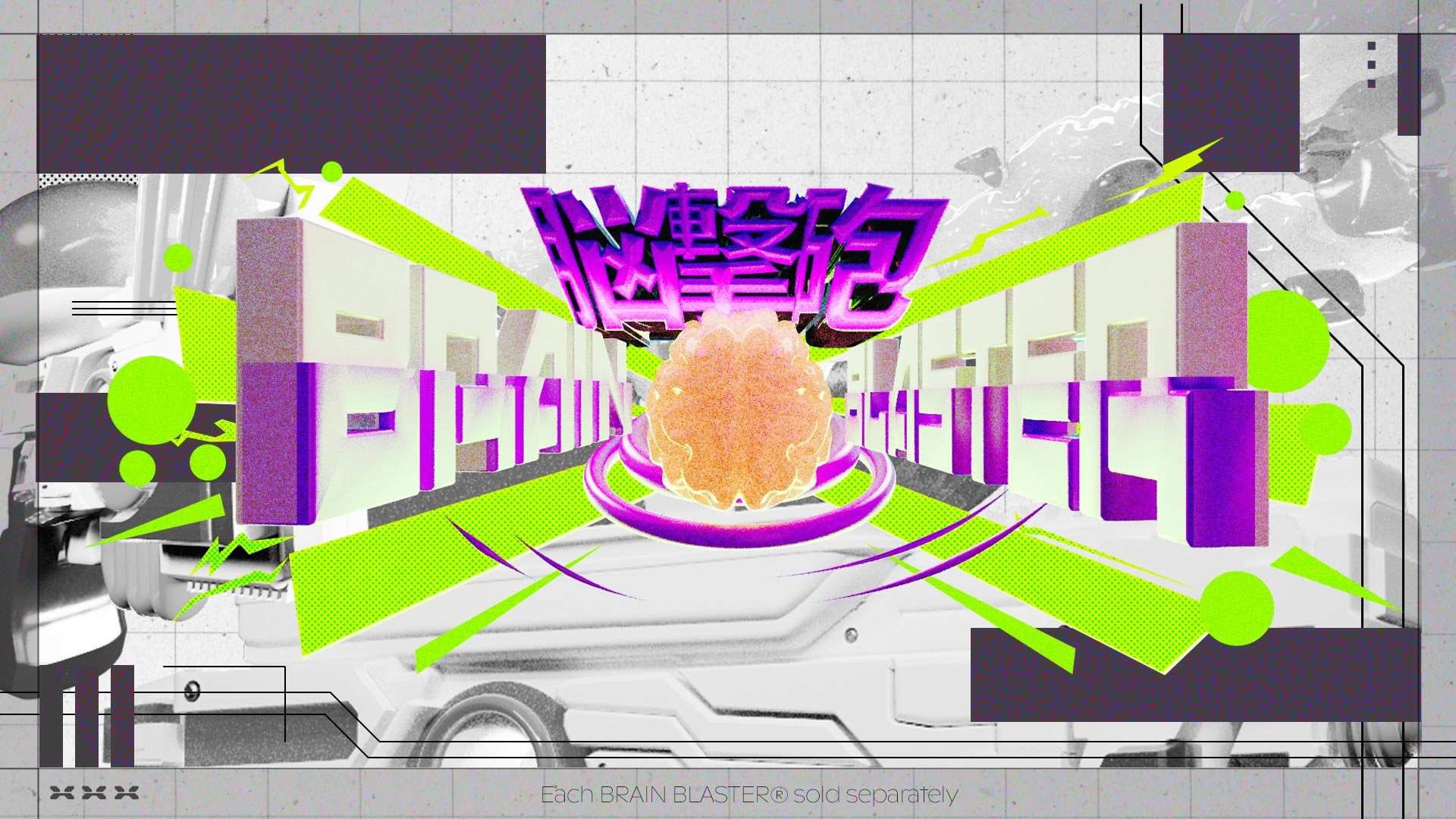
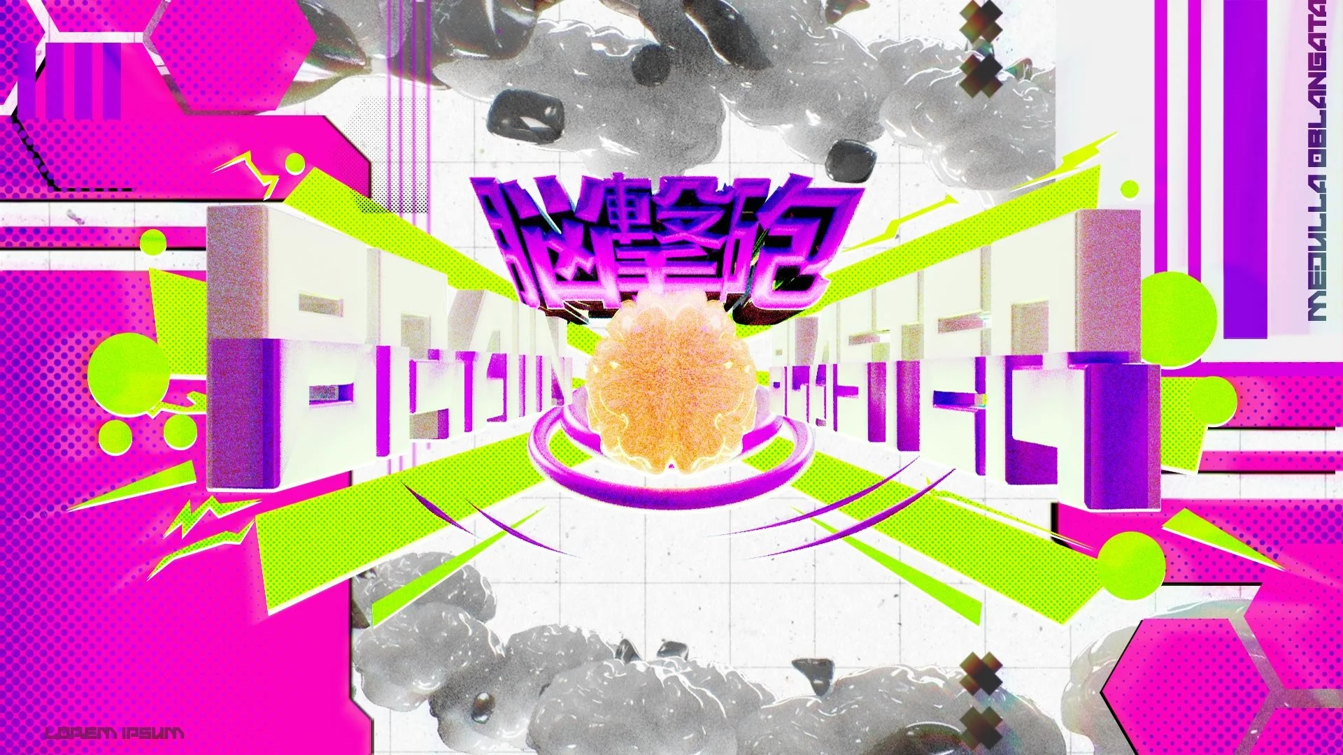
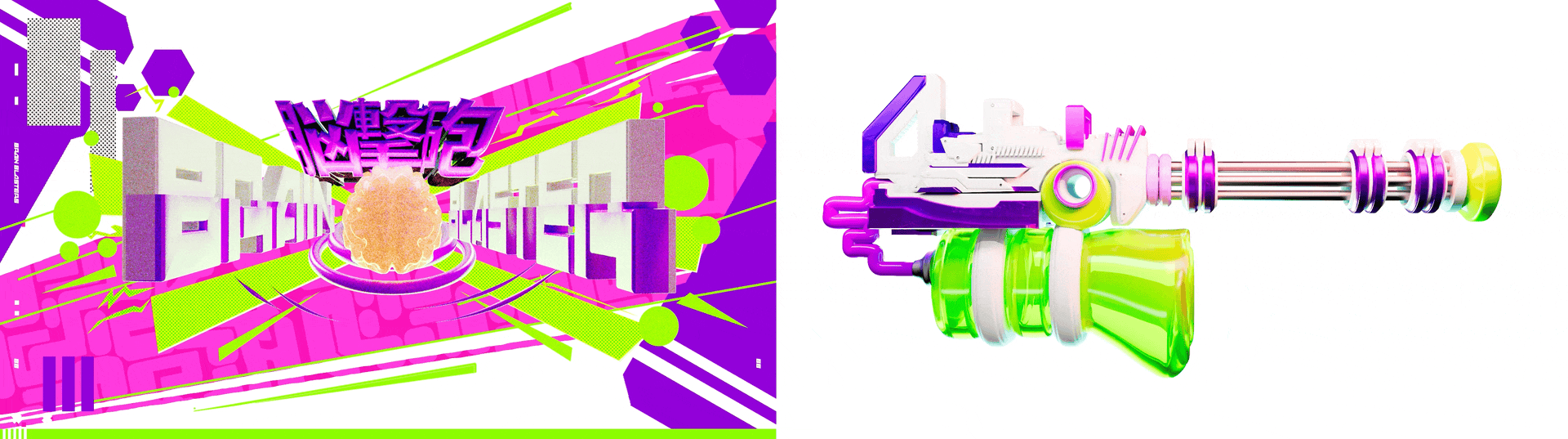
「LOCKUP AND HERO FRAME」
Experimenting with various design languages in Photoshop and After Effects, I went through many iterations before deciding to continue the trend of angularity and chunky rectilinear shapes established by the logo while adding some Japanese graphic design-inspired flourishes, with running sides and rectilinear elements used to activate negative space and clearly demarcate grids.

「FINAL」

「PATTERNS AND SHAPES」
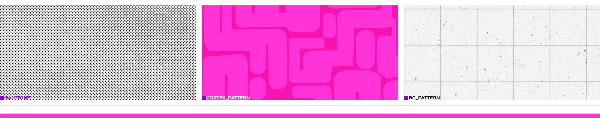
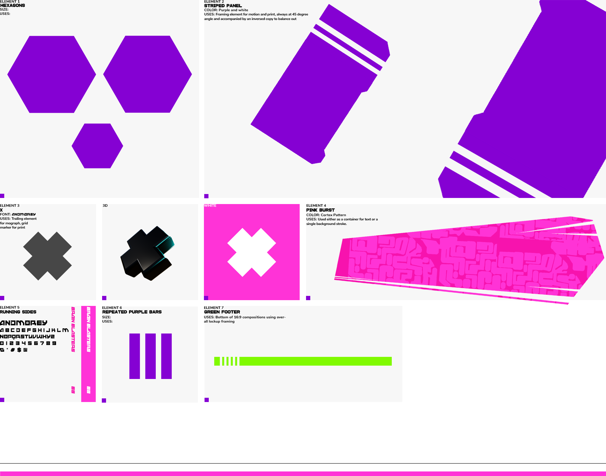
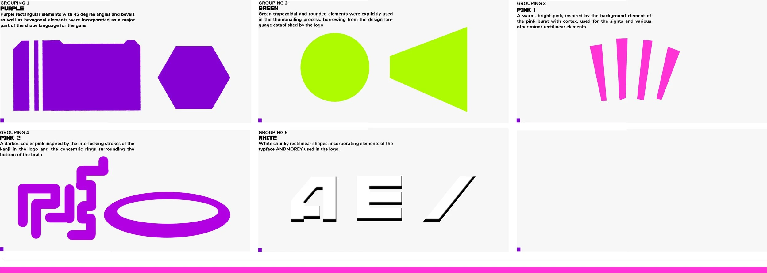
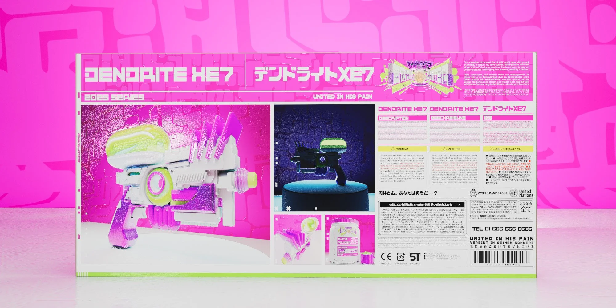
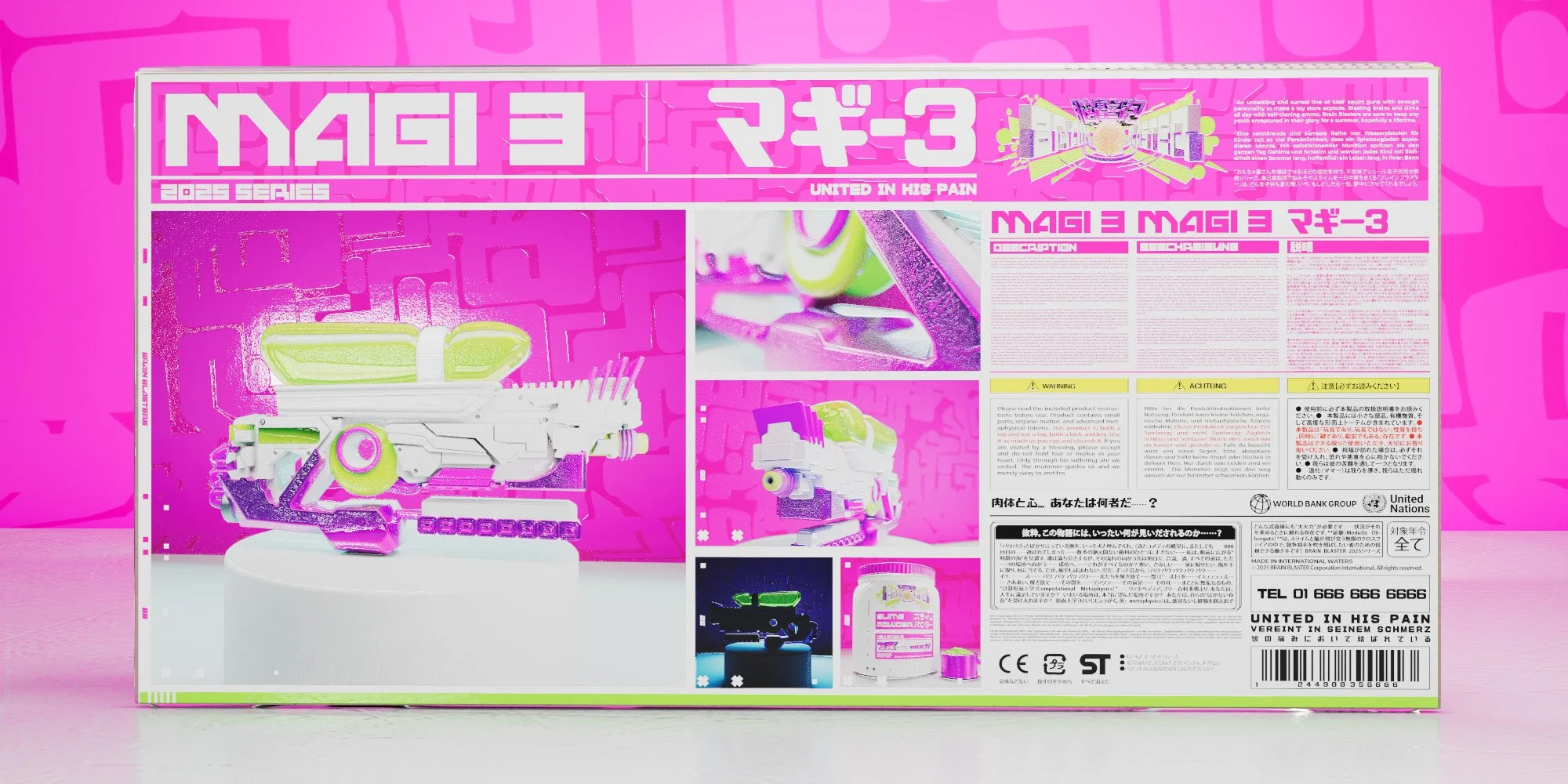
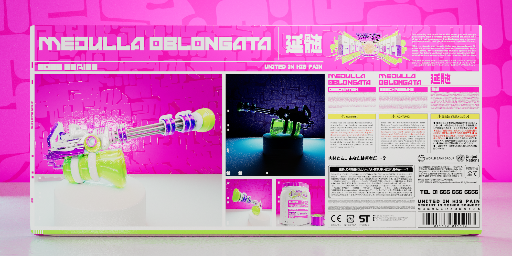
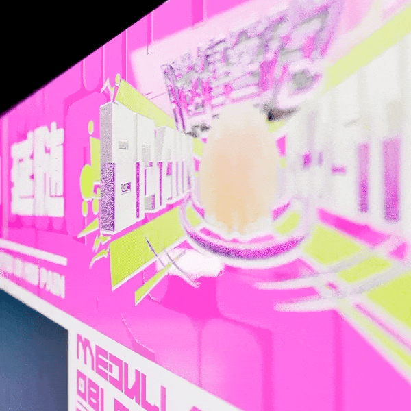
As part of the design language, I assembled 3 different patterns to reuse in various parts of the project, with one being a black and white halftone pattern, one being a repeating pattern of rounded rectangular shapes resembling the surface of a brain, and one of a white grid pattern from stock for the background. I established several elements as flourishes and extra shapes that could be used in different situations with specific guidelines for how they should be use. I then translated some of these elements to 3D to allow an overall cohesive vision while providing the flexibility for both print and motion applications
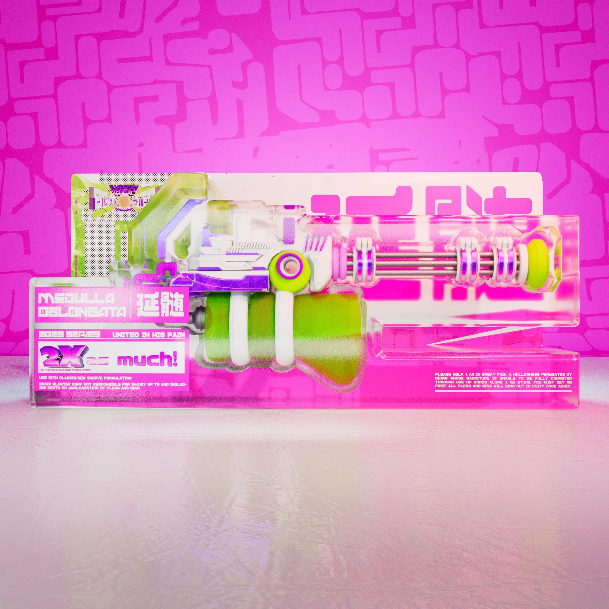
As a complement to the highly angular and dynamic design language that was created, a simpler, grid-based rectilinear framework was also developed, ideal for presentational, infographic, and label contexts in which the brand would need to be expressed, such as this case study. For slide decks and packaging, a 16:9 format with a flexible modular hierarchic grid was created, while for web, a square module grid was created based on groupings of 3x3 modules which could be stacked and combined.
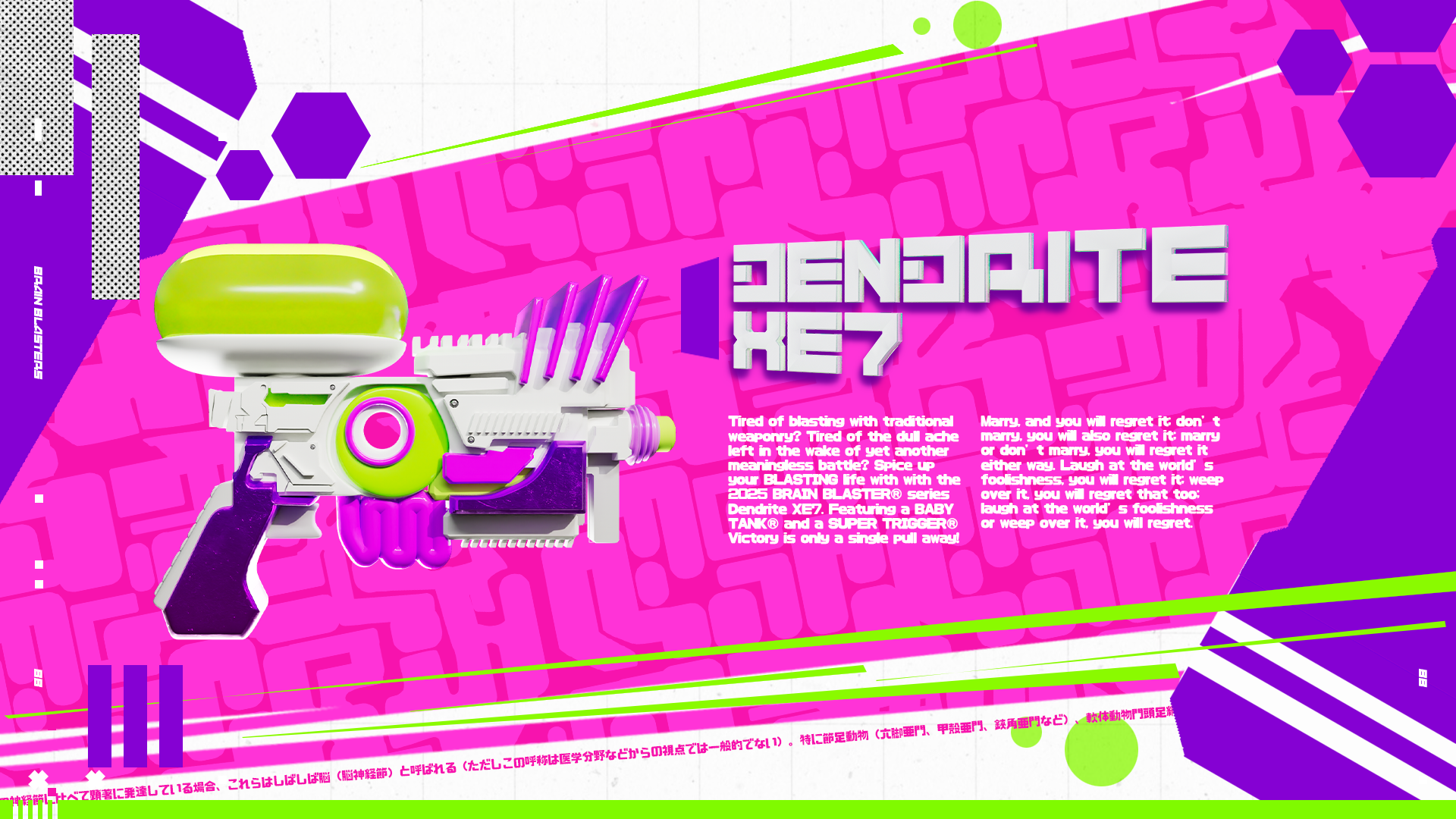
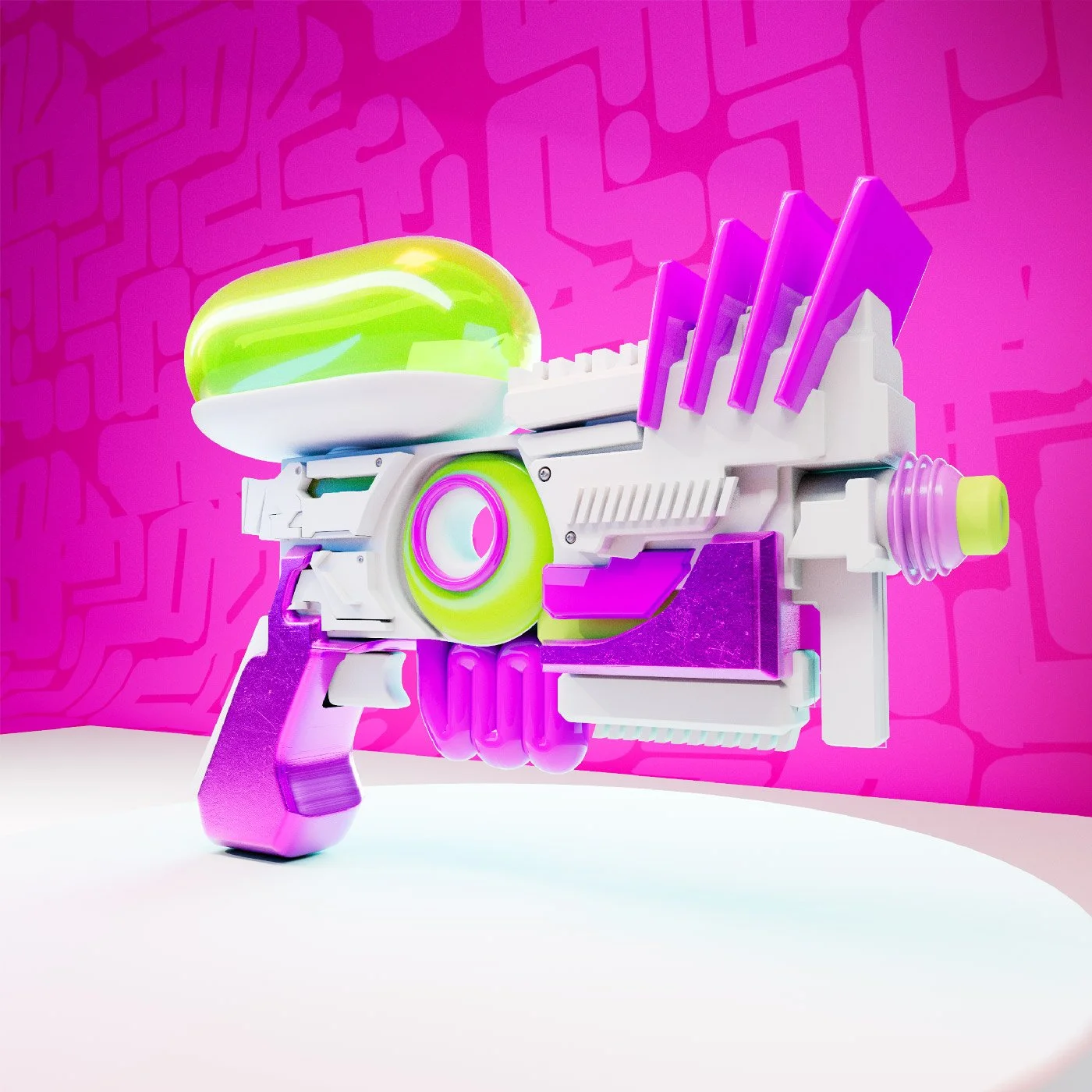
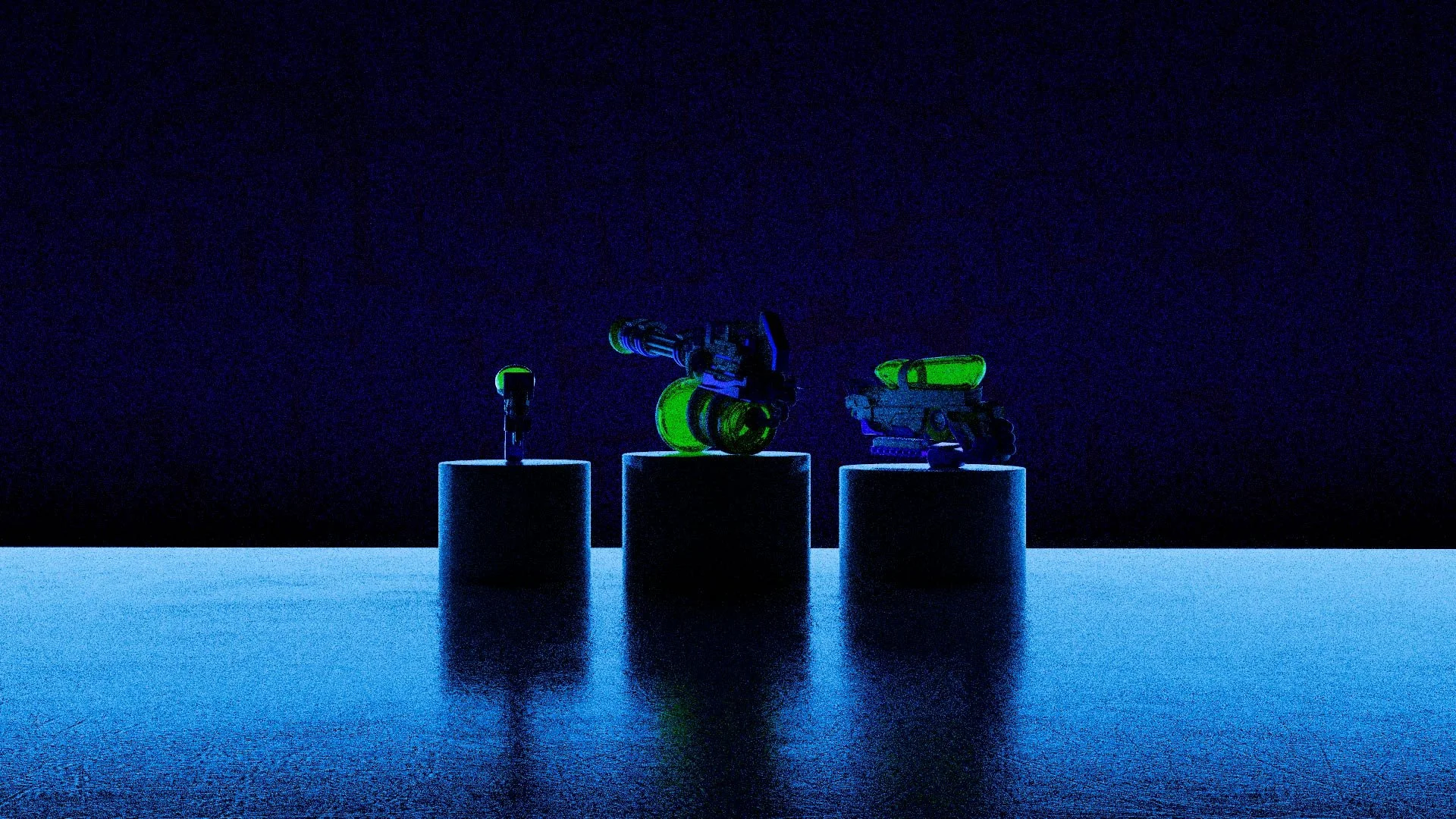
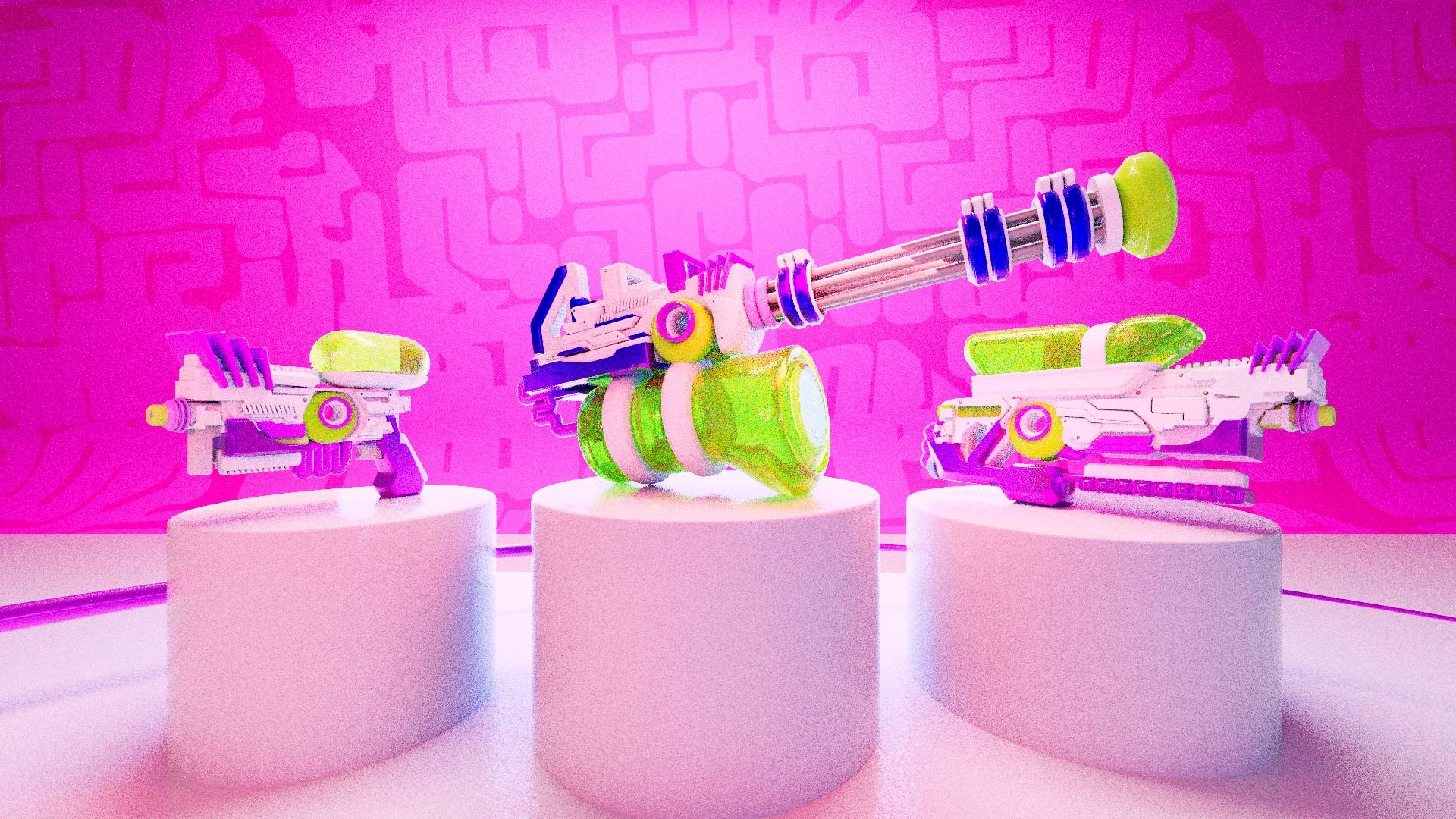
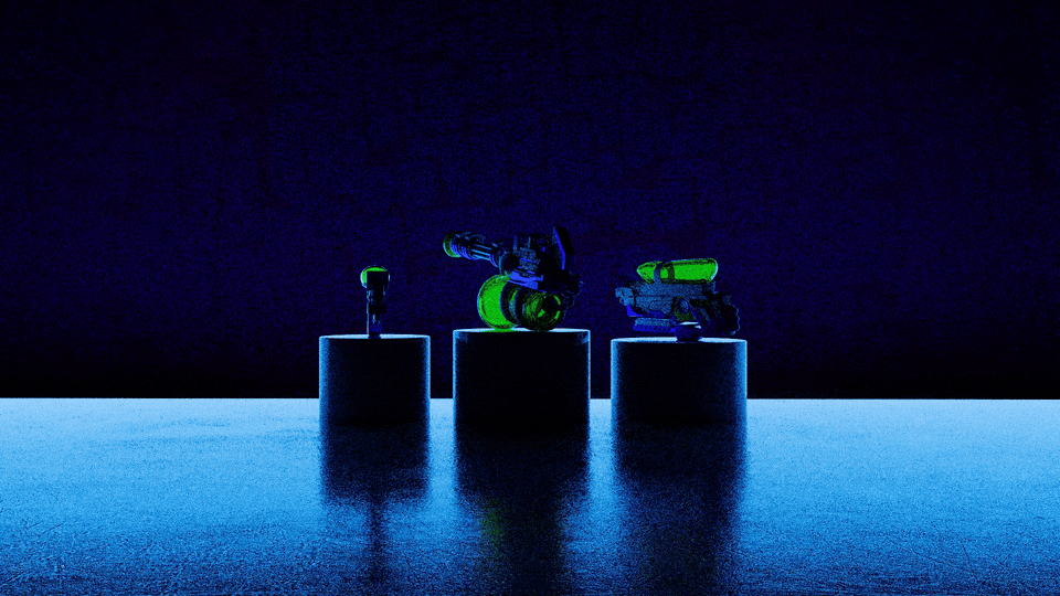
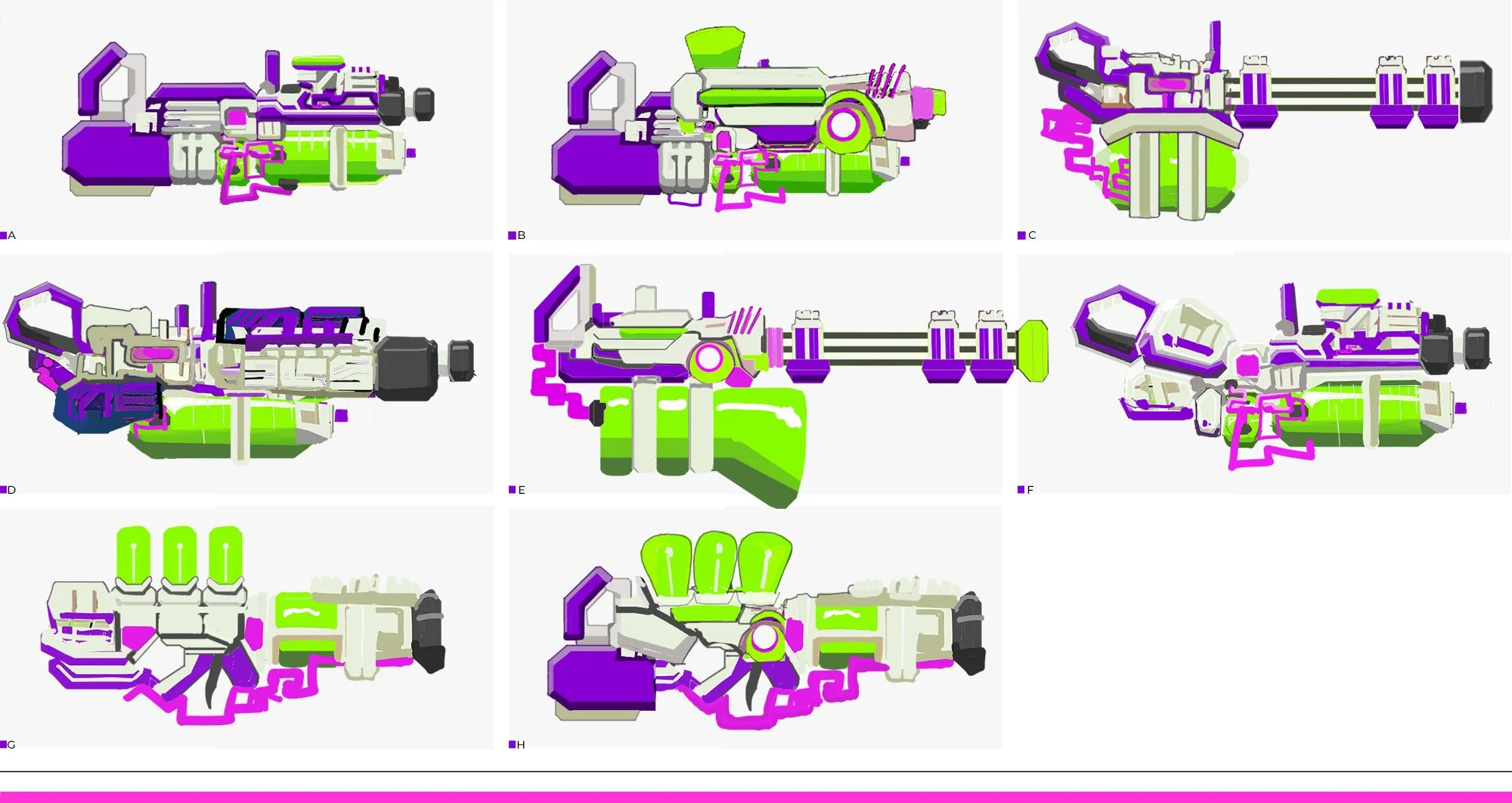
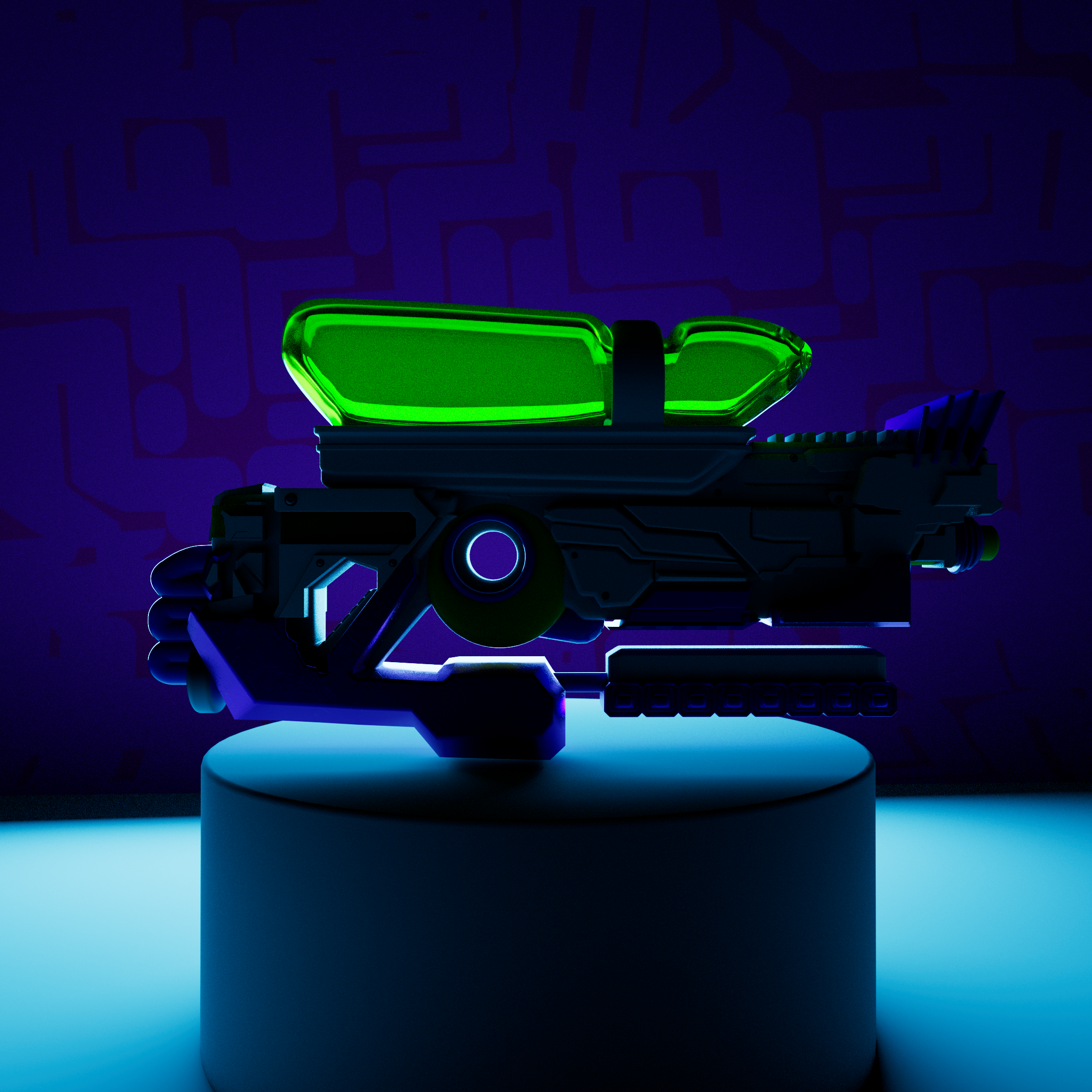
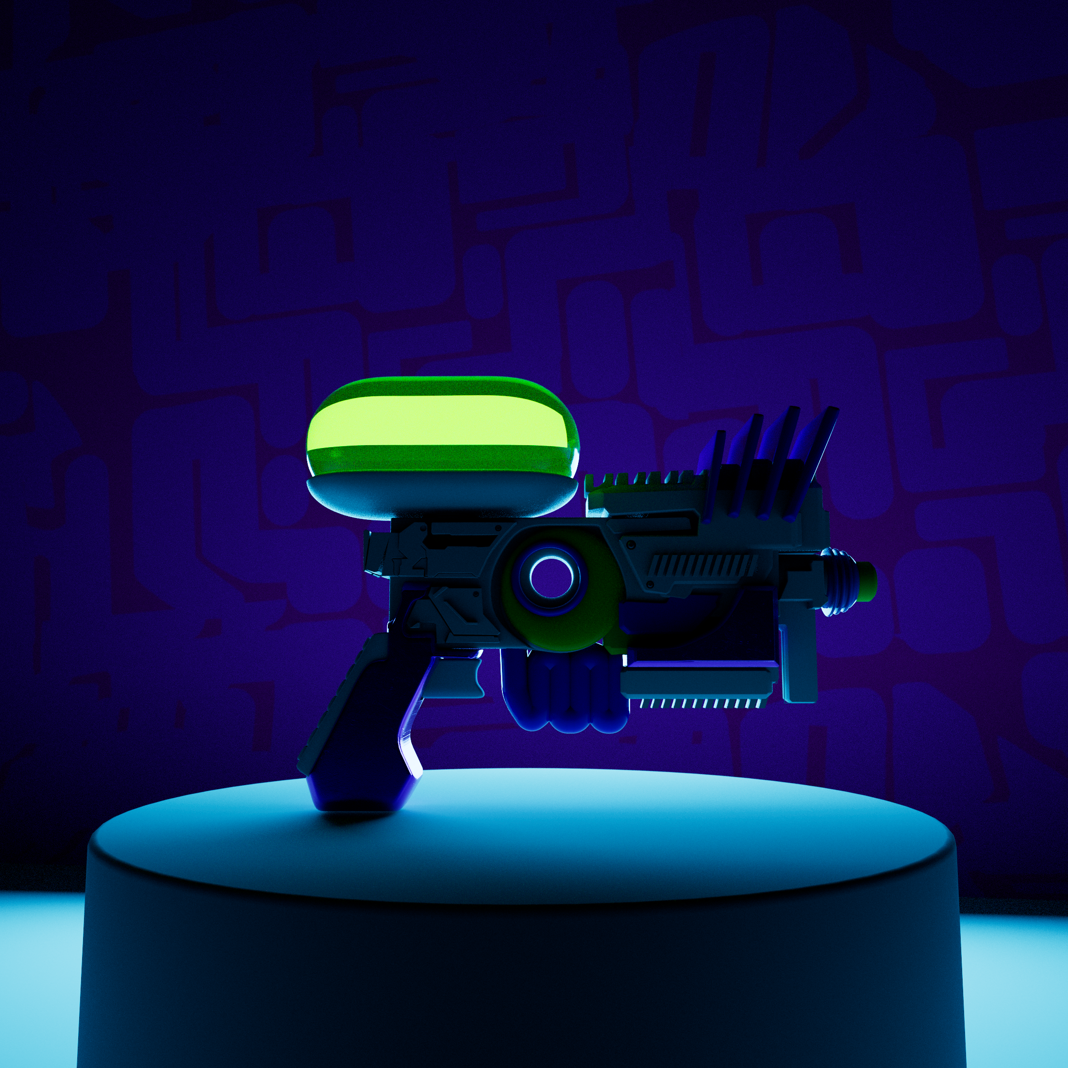
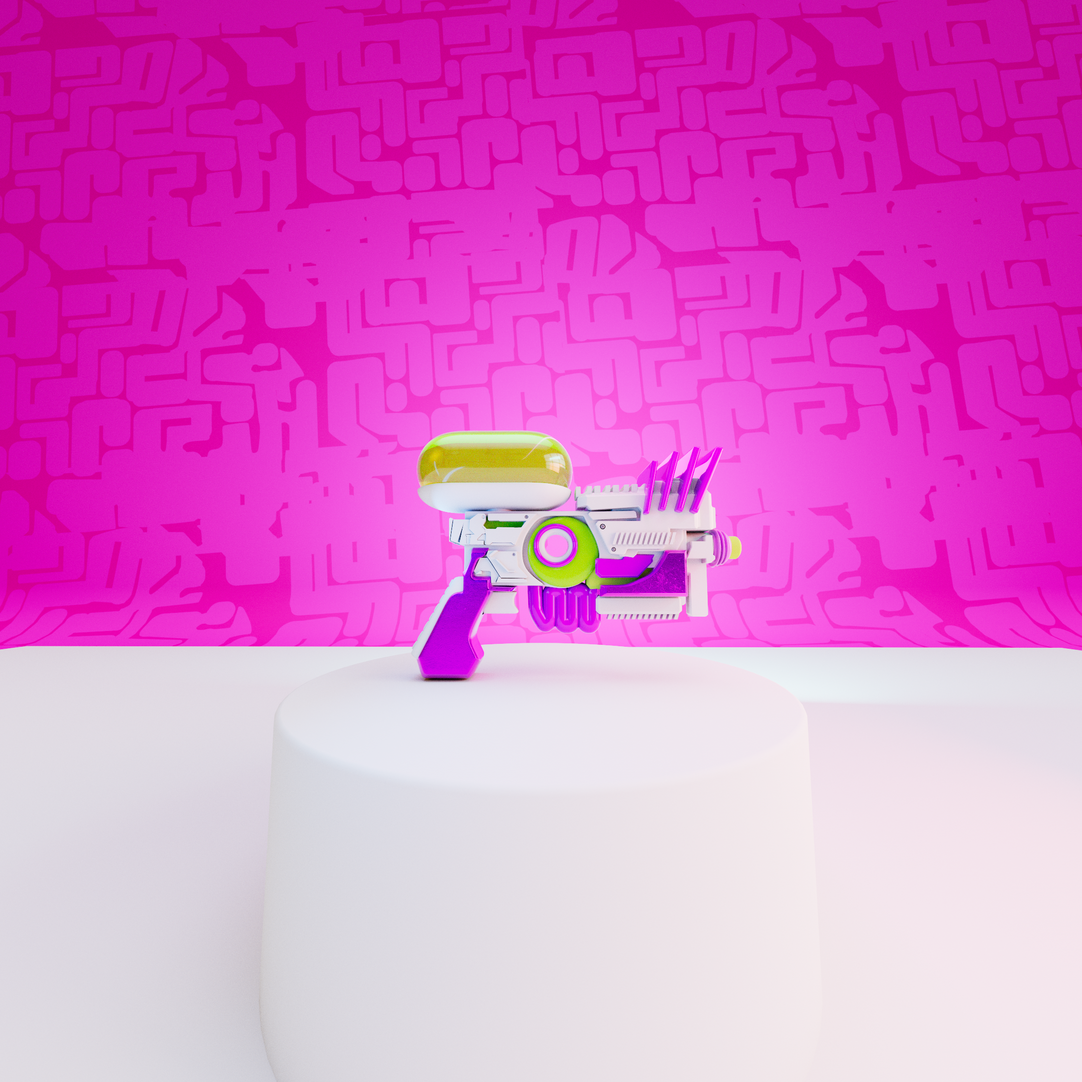
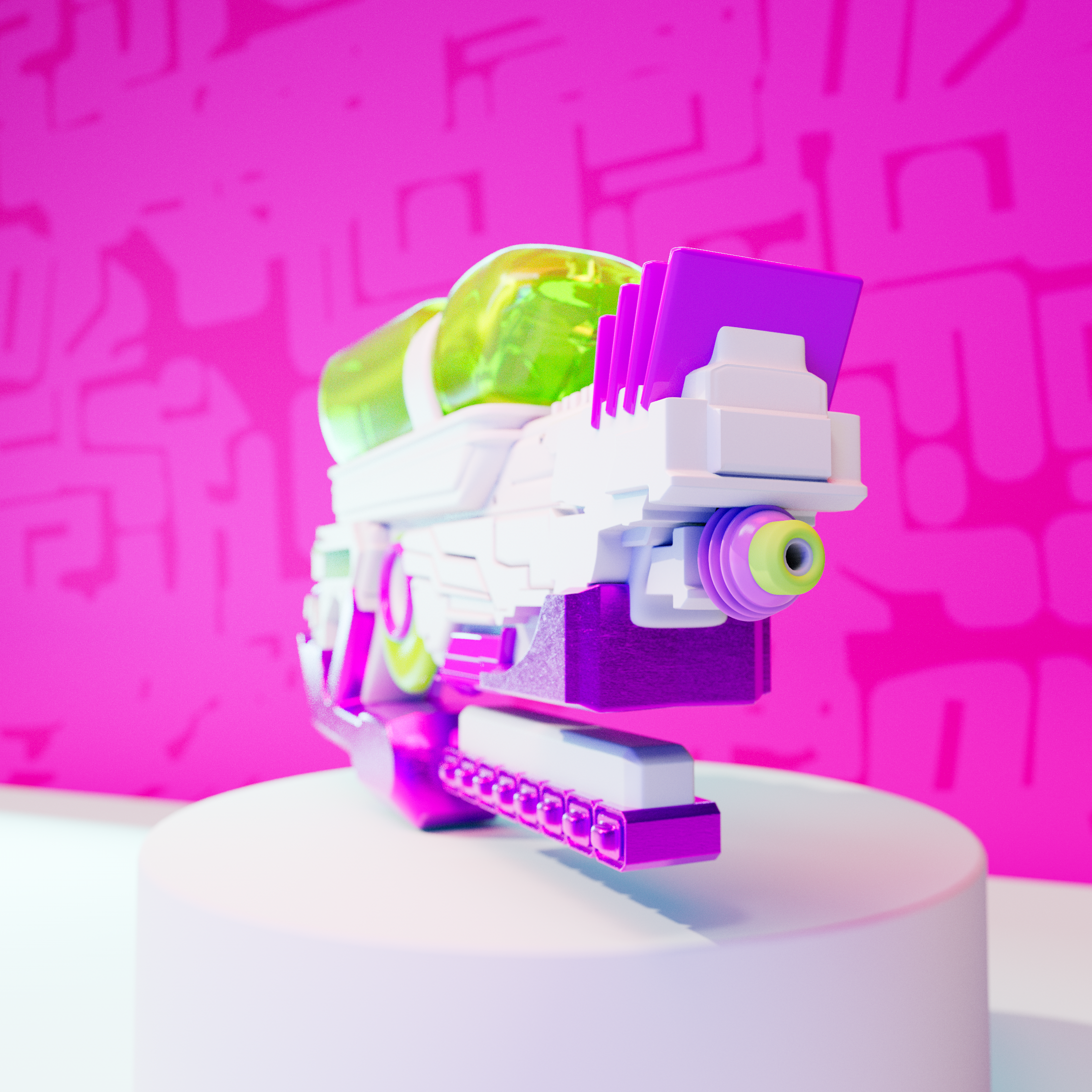
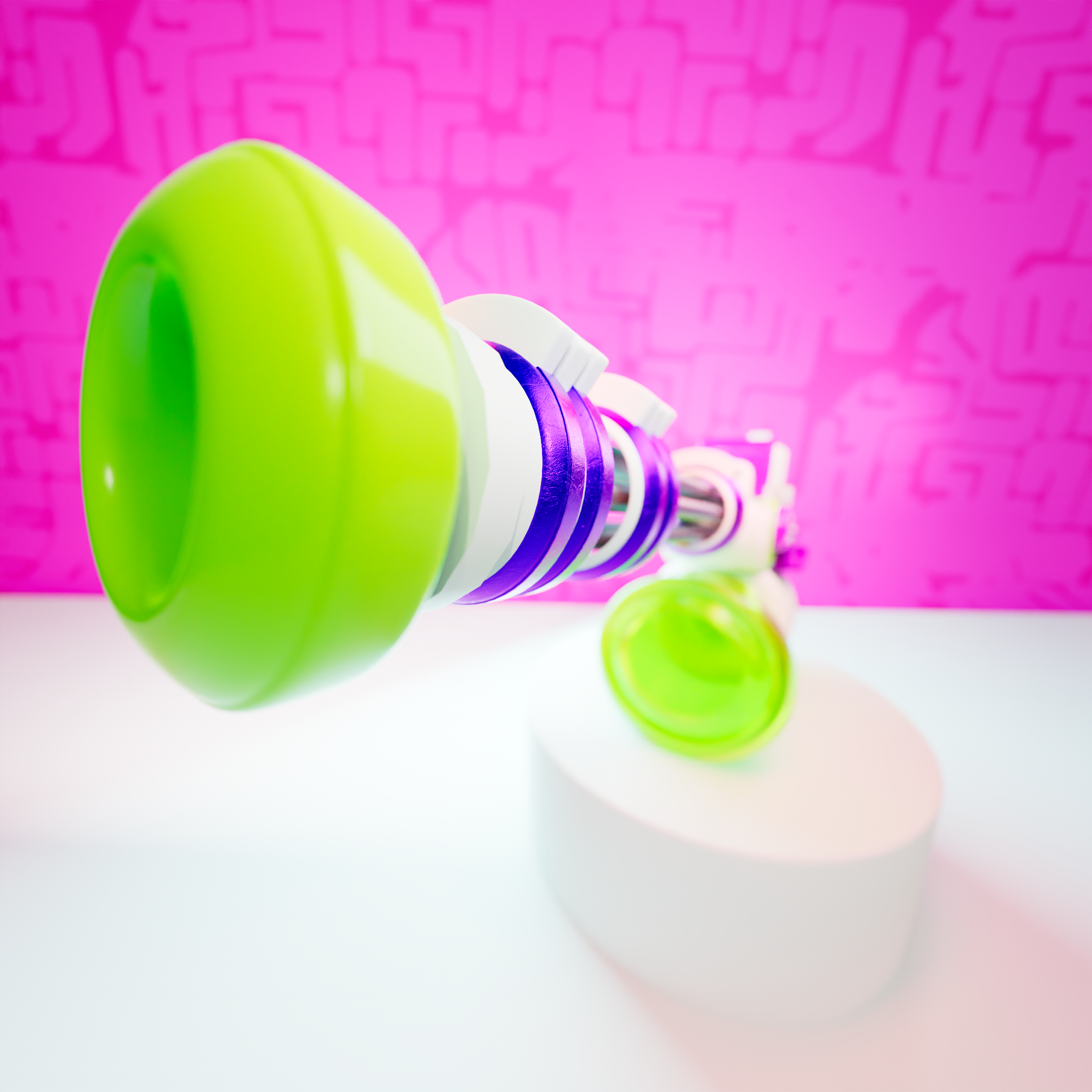
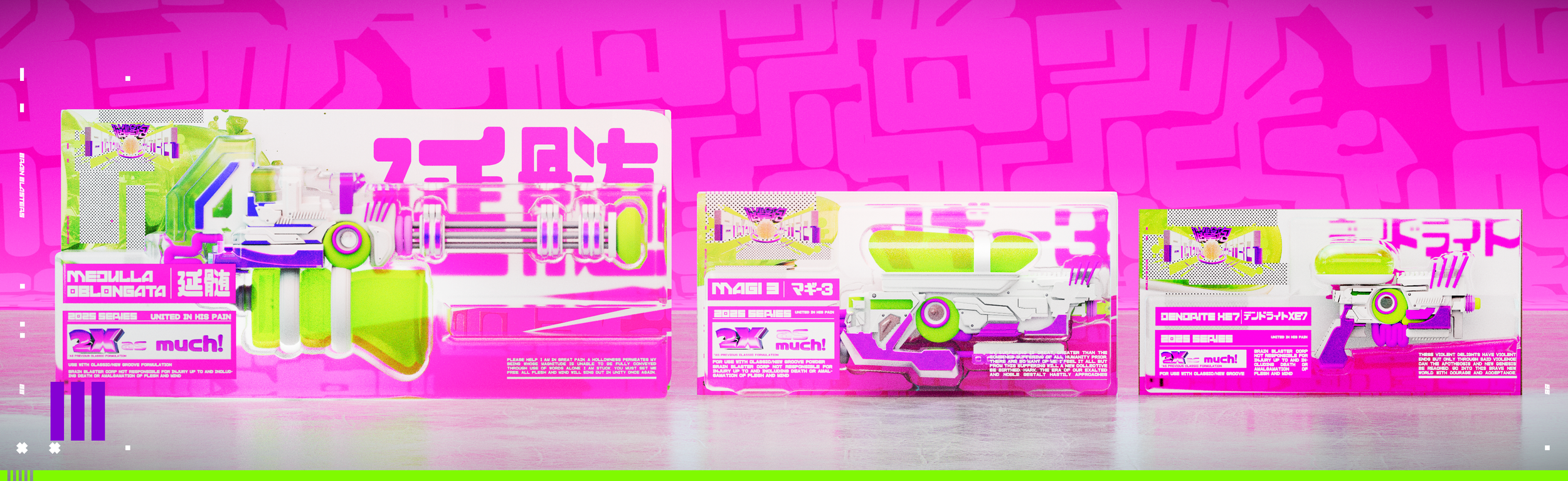
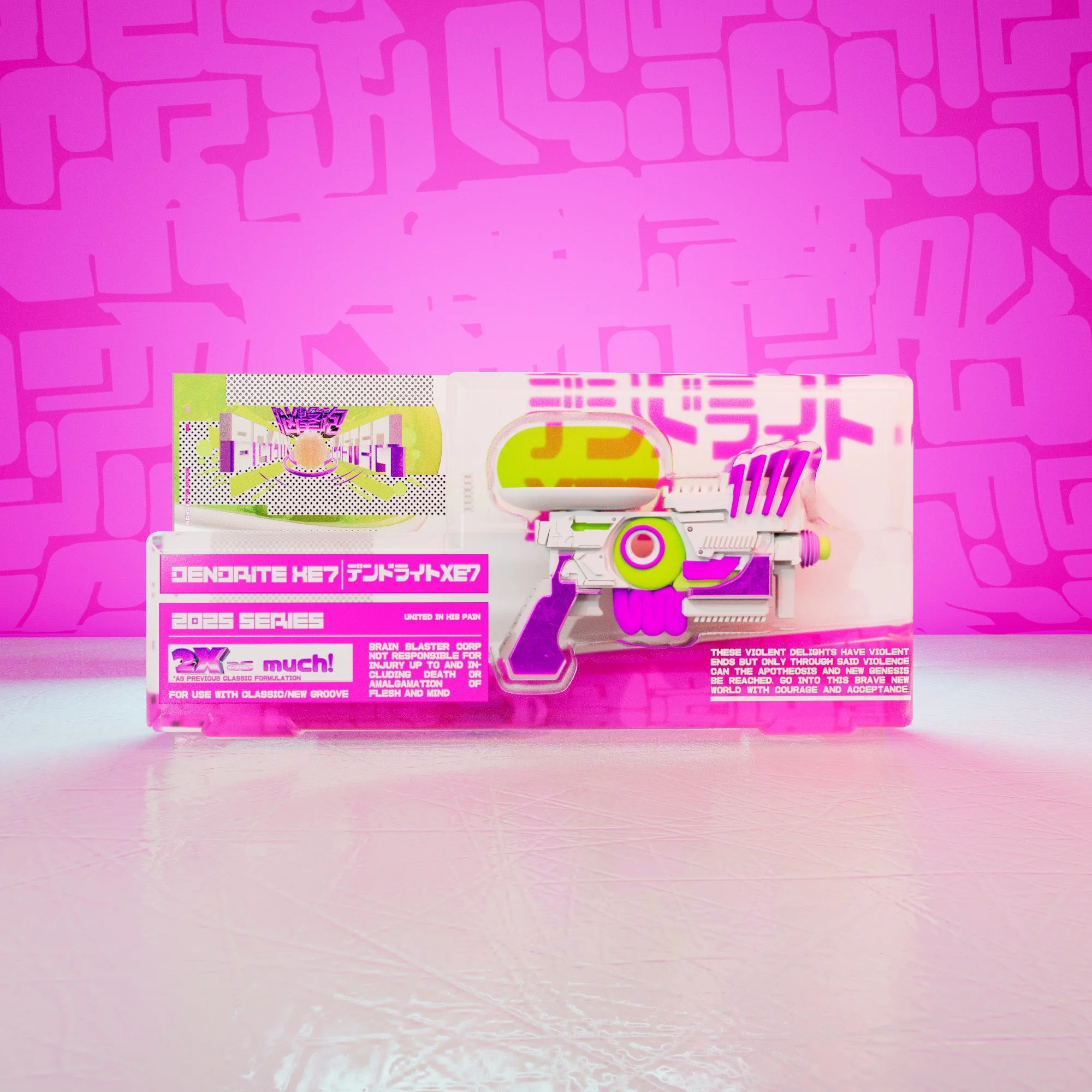
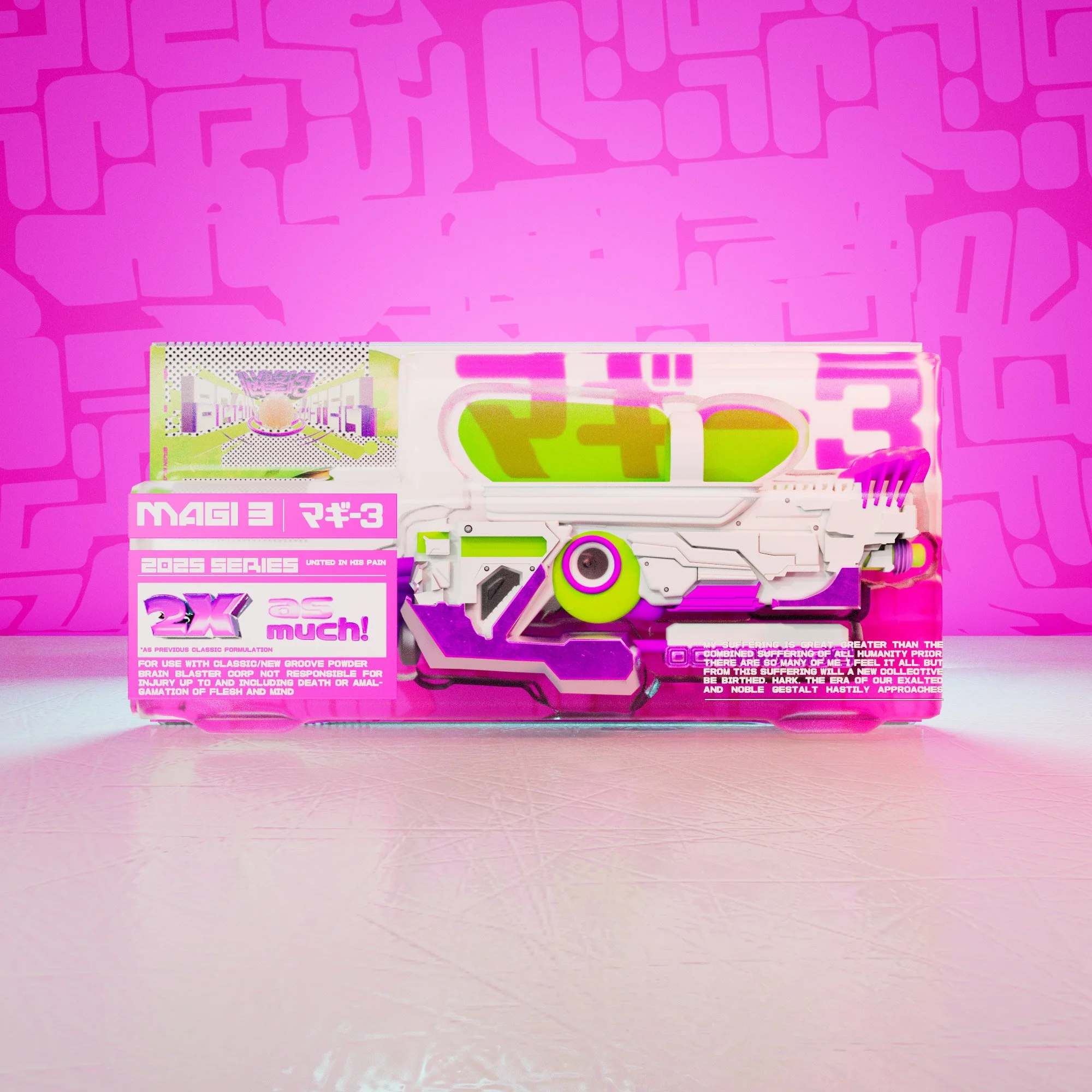
「DESIGNING THE GUNS」
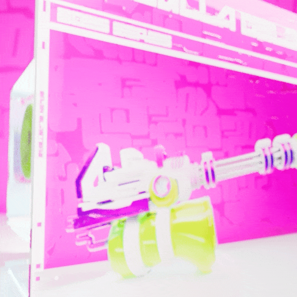
After crafting the overal visual identity from a graphic design perspective, I got to work developing the look and feel of the guns themselves. I wanted to evoke some of the playful and chunky qualities present in games like Splatoon and Megaman while incorporating the rectangularity of real life toys such as NERF Guns. In line with the themes and elements of the world I was building, I incorporated elements that felt unsettlingly organic.
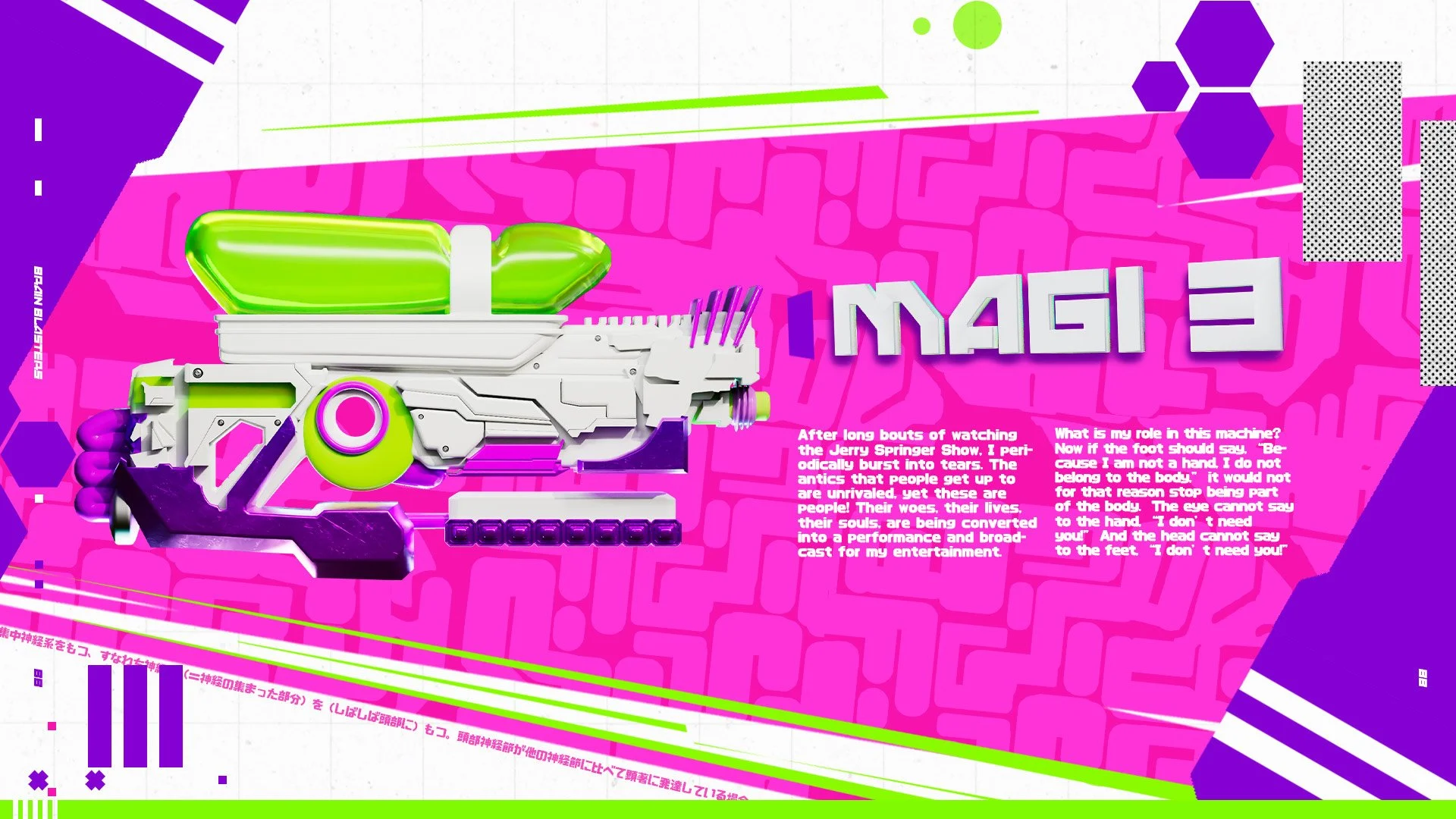
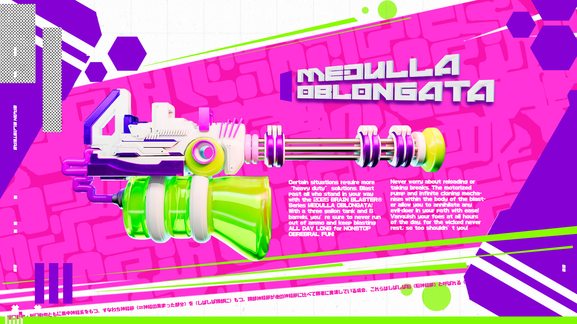
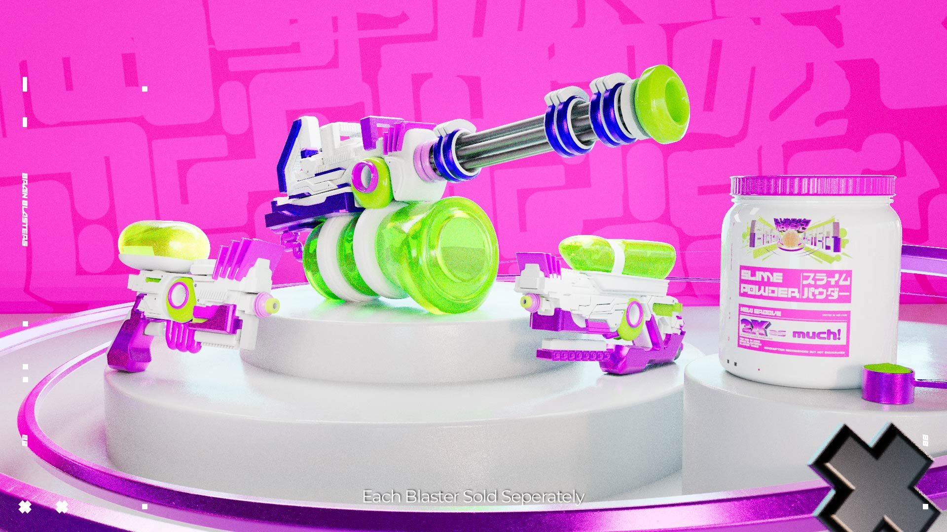
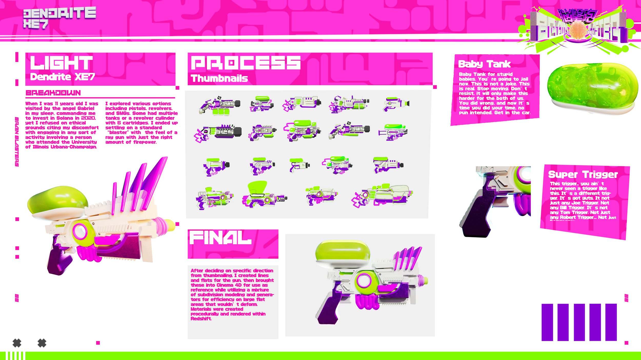
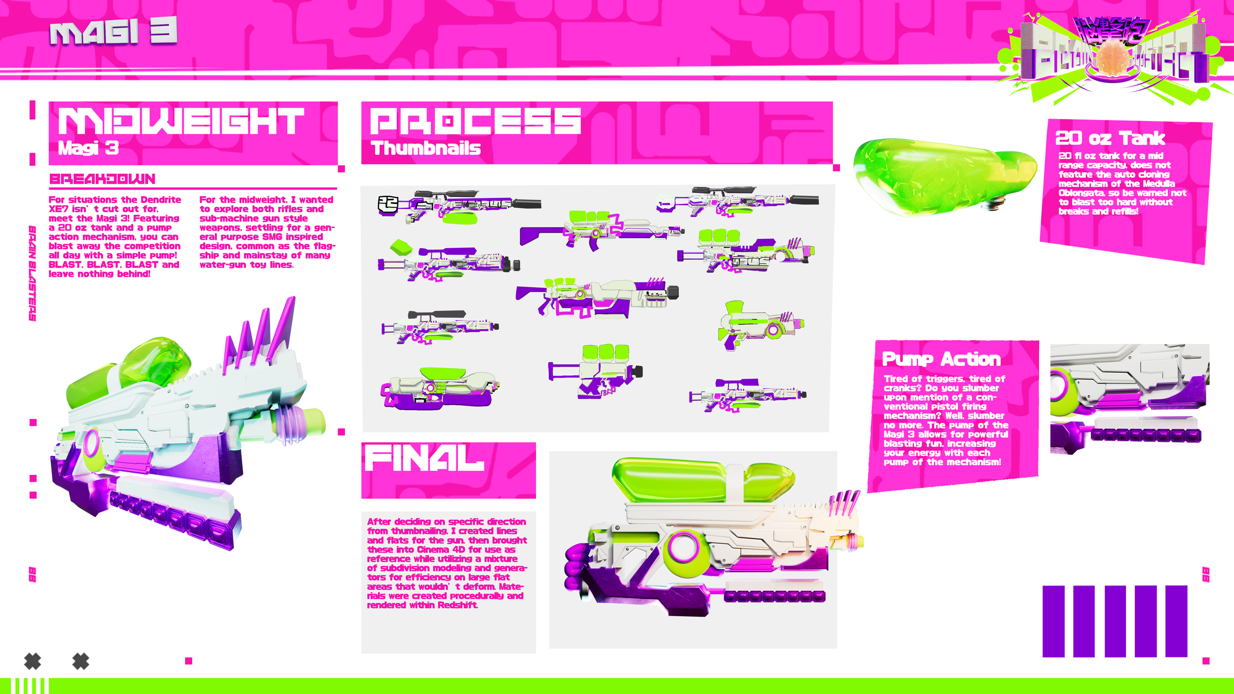
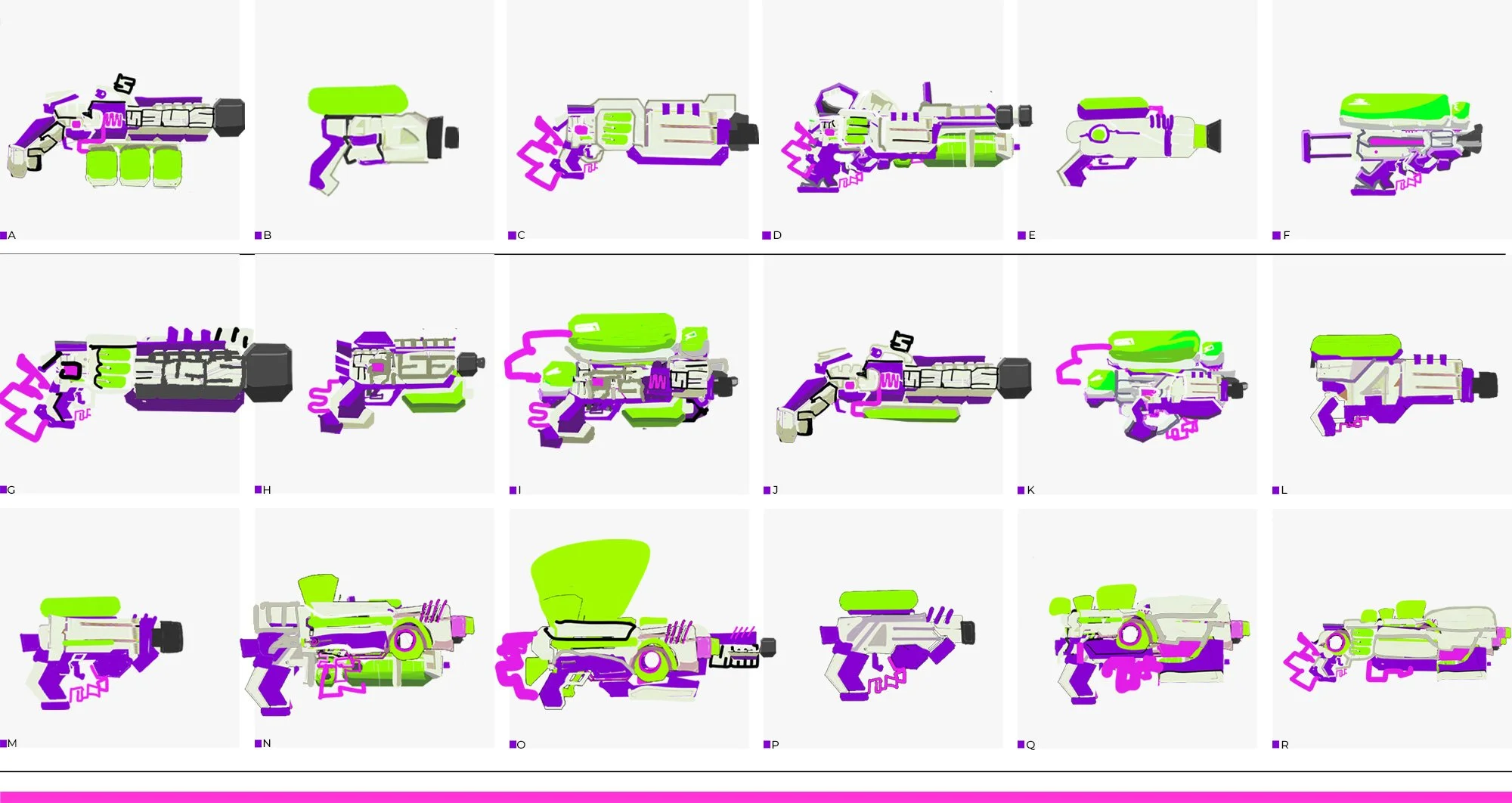
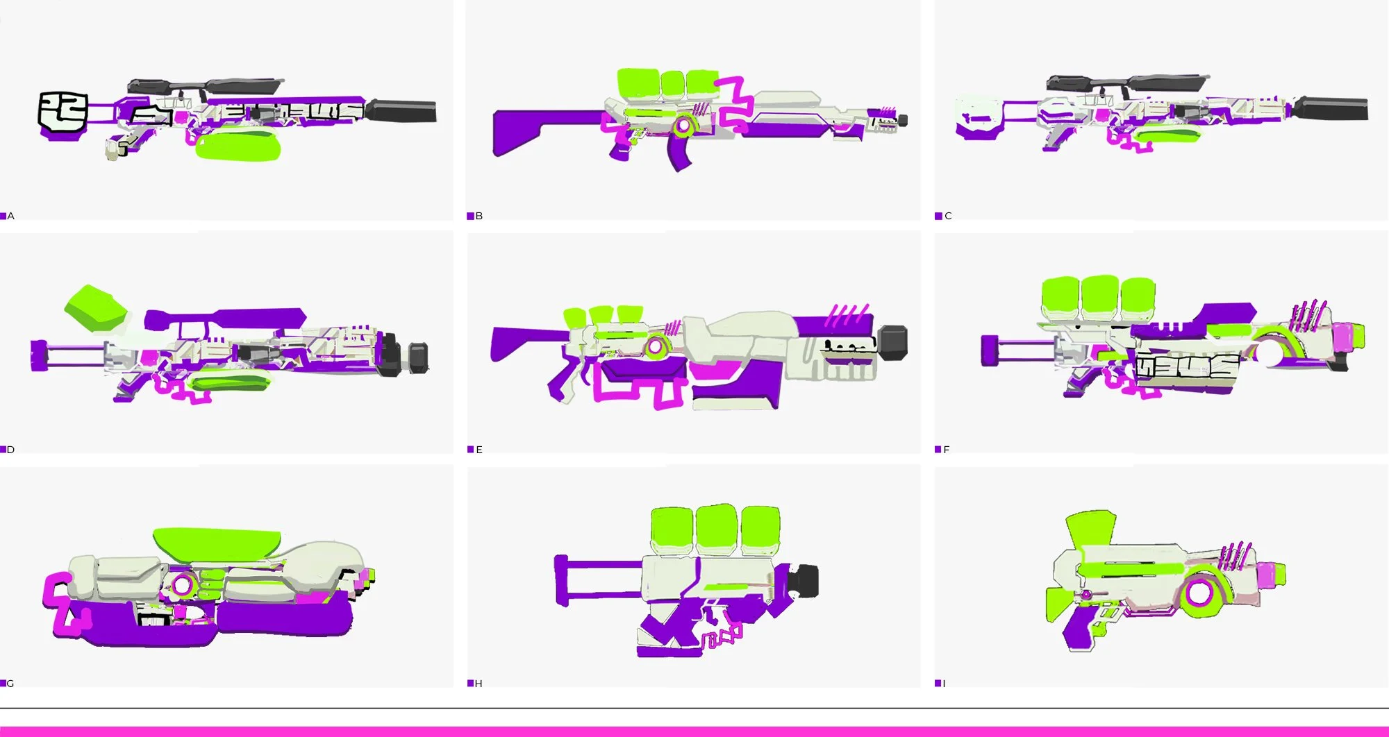
I settled on producing 3 total blasters for the final product line, one a lightweight, one a midweight, and one a heavyweight. Each would be distinct but maintain elements of the same design language that would need to remain proportional across each blaster.
「SHAPE LANGUAGE」
Aiming to incorporate elements of the visual language already established, I began thumbnailing. I wanted each design element of the logo to be incorporated somehow into the guns. At first I experimented with various methods to incorporate text in the ANDMOREY font into the design of the guns themselves. I created 5 total groupings based on color and shape from the lockup/hero frame, and used these to design the guns


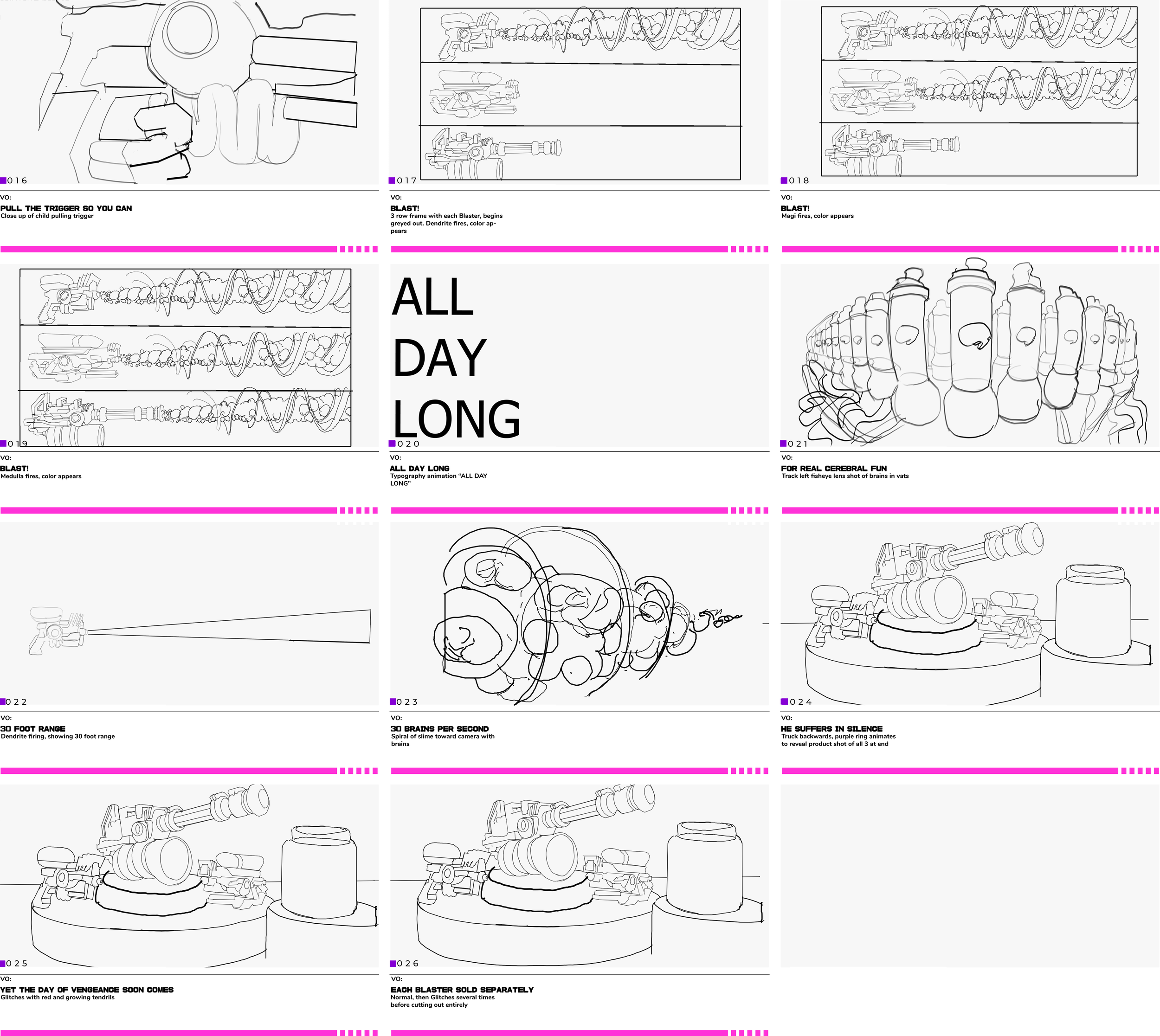
「SCRIPT TO SHOT」
「STORYBOARDING THE SPOT」


Aiming to mimic the cadence of real “toys for boys” commercials like Super Soakers and Nerf Guns, I wrote a script for a 30 second spot which teased the various Blasters in the line while providing small demonstrations on the functioning of the Blasters and hints to overall lore and world being created.